Case study · 2026

Nisha Perfume

A perfume store redesigned around how people actually choose a scent: website, iOS and Android app, and one design system for both.

Company
CodeGeeks
Role
Sole UX/UI Designer
Platforms
Website, iOS and Android app, design system
Status
Website released · live site · app in development
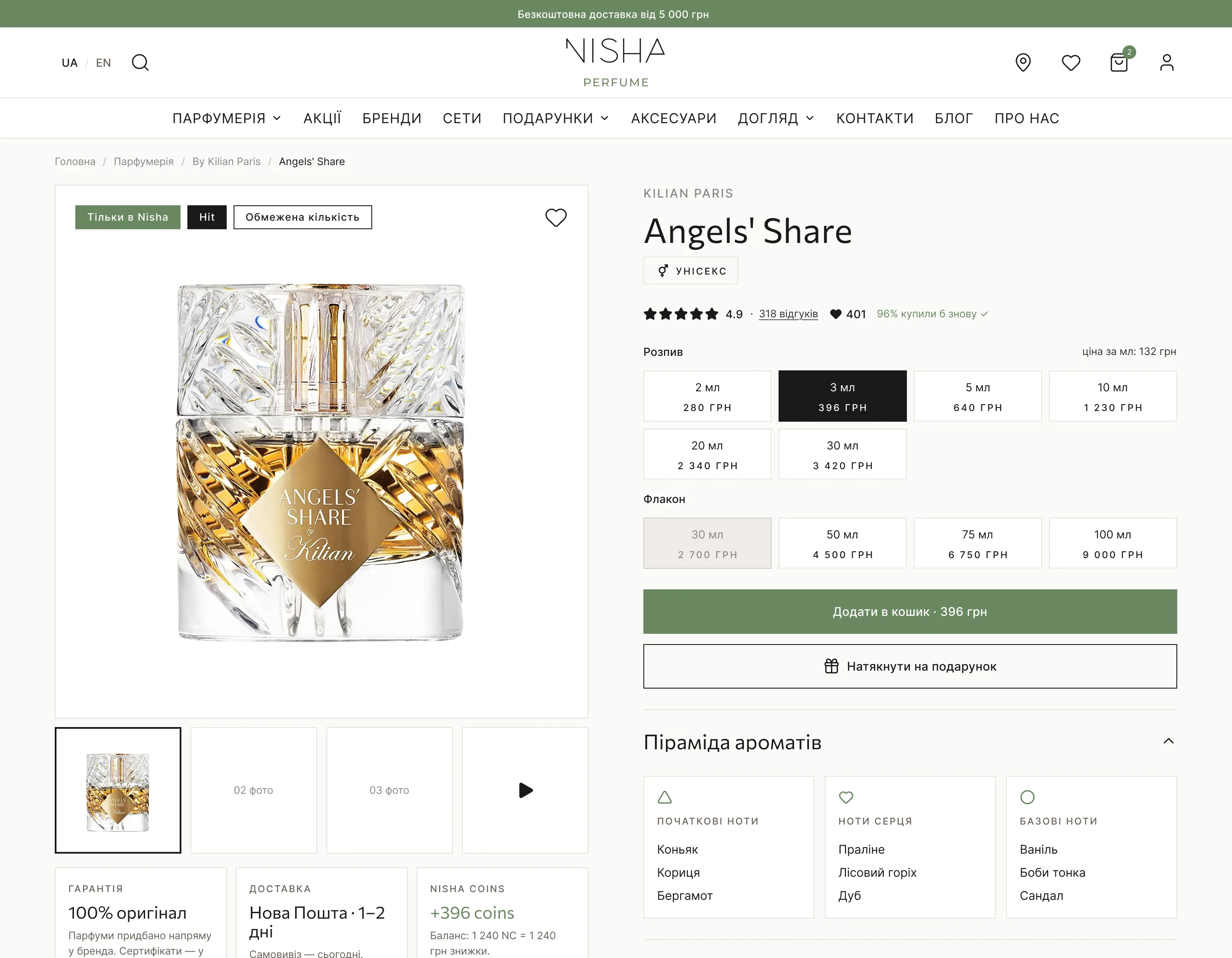
Nisha Perfume product page for Angels' Share on desktop and mobile: volume options from 2 ml, rating and add-to-cart.

The task

A store that didn’t help people choose

Nisha Perfume sells original and niche perfume in Ukraine, in full bottles and by the millilitre. The client came with a working website and app and wanted both improved, in UX and in UI.

The old store looked like a template and didn’t help people choose a scent:

  • banners in different styles, with no single message;
  • product cards with only a name and a price;
  • selling by the millilitre, the store’s strength, was hidden;
  • an Instagram block took the main place on the home page.
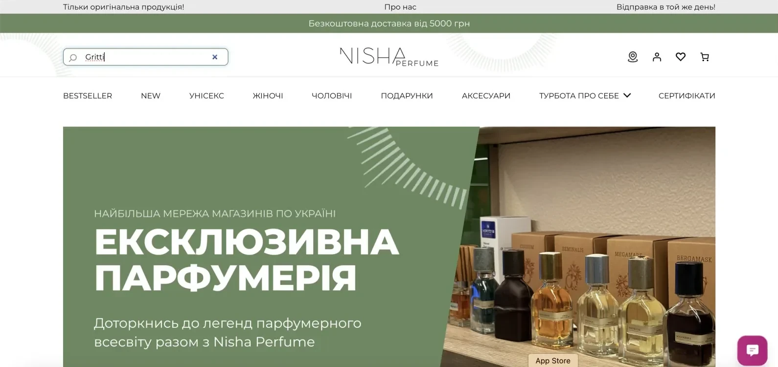
The old Nisha home page: a green banner in a different style from the rest of the page.
The old home page
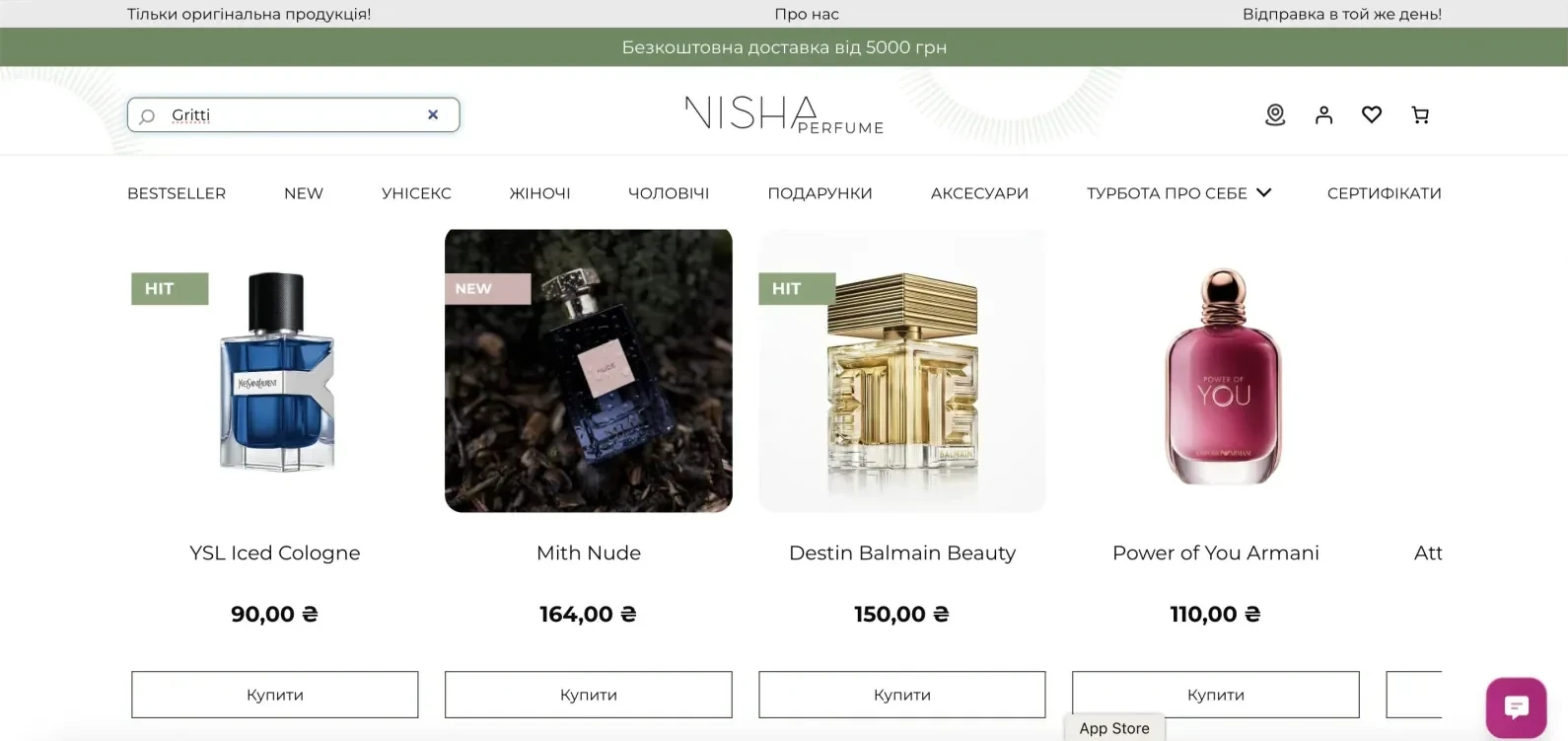
The old Nisha catalog: product cards with only a photo, a name and a price.
The old catalog: name and price only

How I worked

From design sessions to handoff

I was the only designer on the project and worked in a full team with developers, QA and a project manager.

  1. Design sessions with the client to talk through problems and ideas.
  2. Competitor analysis on the Ukrainian market, to solve the client’s business problems and see how others work.
  3. Information architecture, agreed with the client before any design.
  4. UX audit of the old website and app.
  5. User flows, wireframes, UI and prototypes in Figma and Claude Design.
  6. Handoff to developers and checks that the build matches the design.

Key decisions

What changed and why

One clear message on the home page

ProblemThe home page had no focus: banners in different styles and an Instagram block in the main spot.

DecisionOne message in the hero, try any scent in a small volume; top brands and “New & bestsellers” right after it; dark warm banners with one green accent.
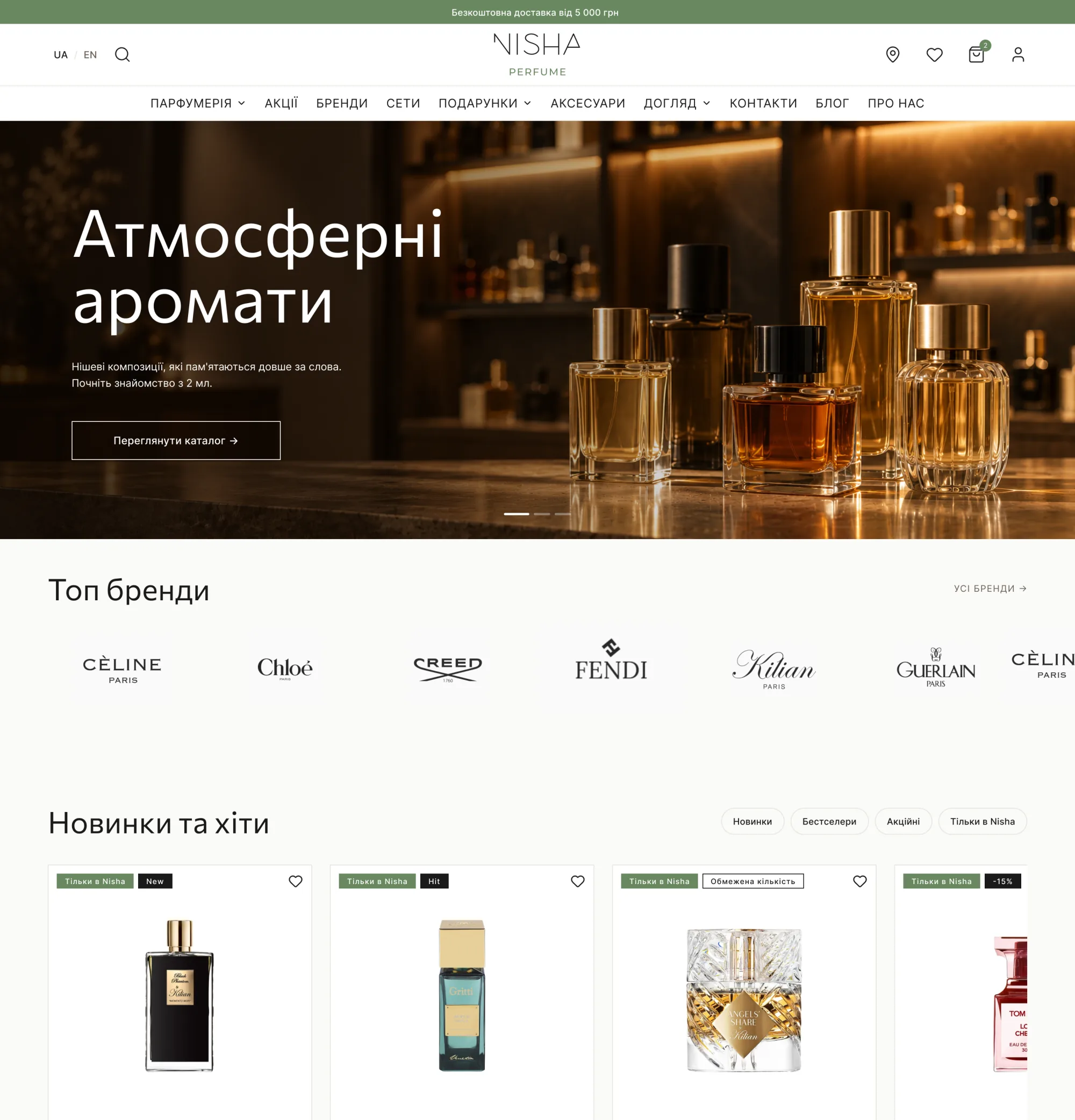
New Nisha home page on desktop: dark hero “Atmospheric scents”, top brands and new arrivals.
Home page, desktop
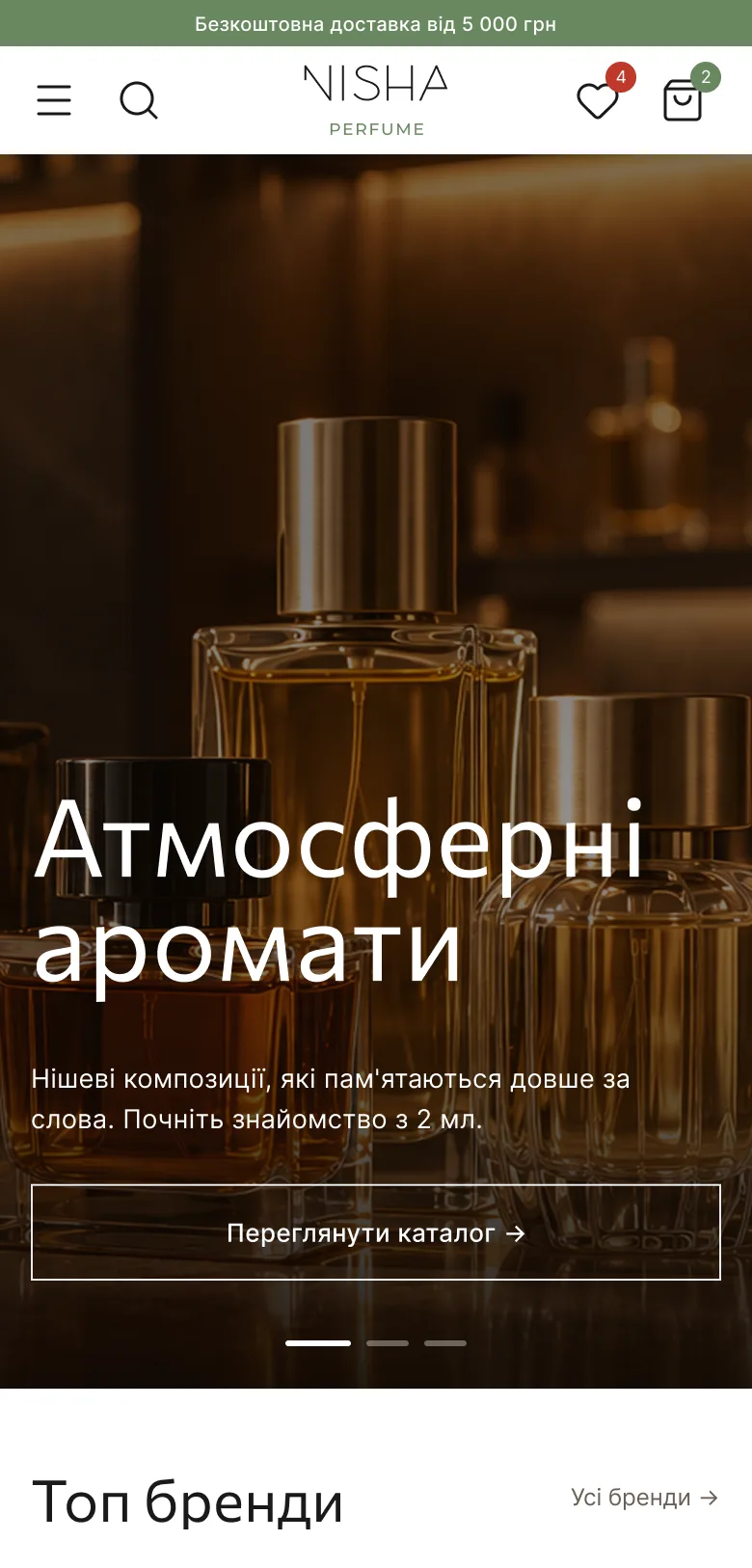
New Nisha home page on mobile with the same dark hero.
Mobile

Choose a volume right in the catalog

ProblemSelling by the millilitre was hidden; cards showed only a name and a price.

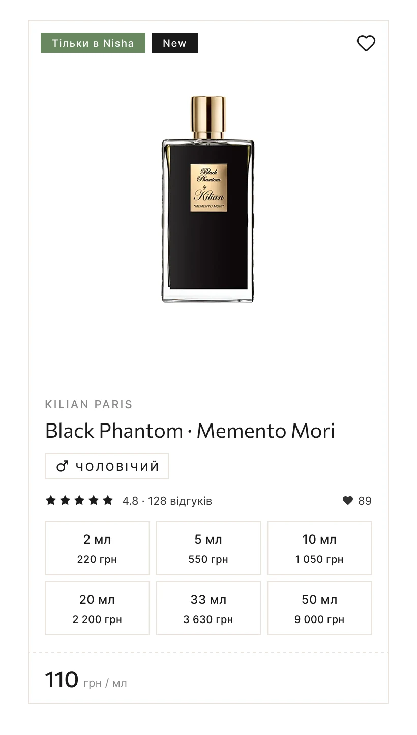
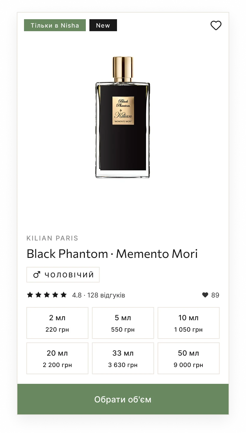
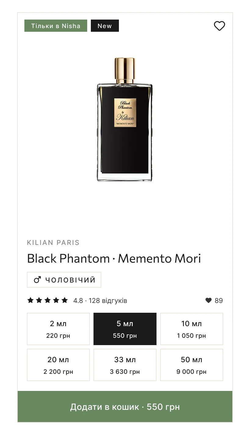
DecisionVolume from 2 ml right in the catalog card, with price per ml, rating, reviews, favourites and a gender tag in one block. The card has three states: default, hover and volume selected.

Product card in its default state: bottle, brand, rating and volume options from 2 ml.
Default
Product card on hover with the “Choose volume” button.
Hover
Product card with 5 ml selected and the price shown on the button.
Volume selected

Filters that match how people search

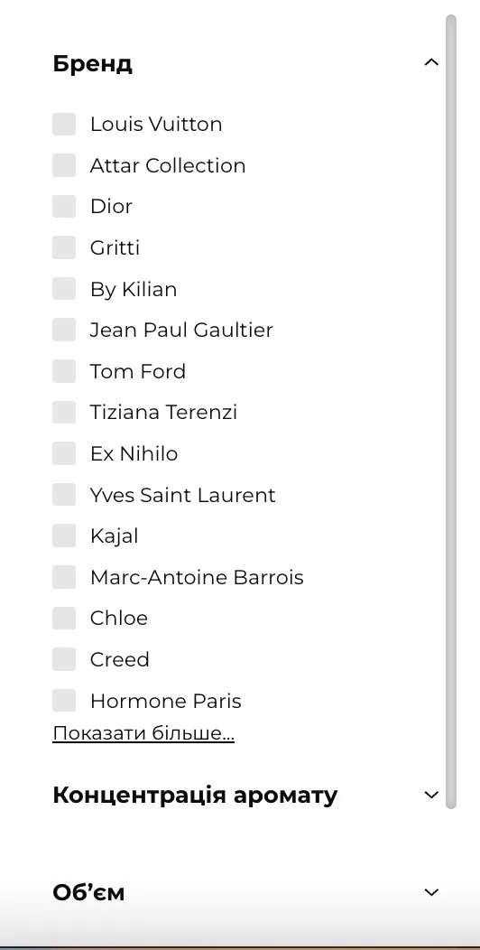
ProblemSeven closed dropdowns: people had to open each one to see what was inside.

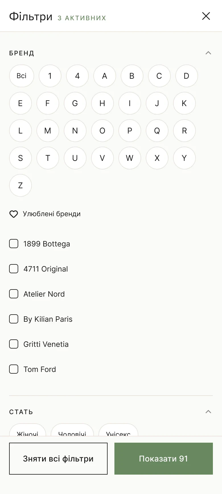
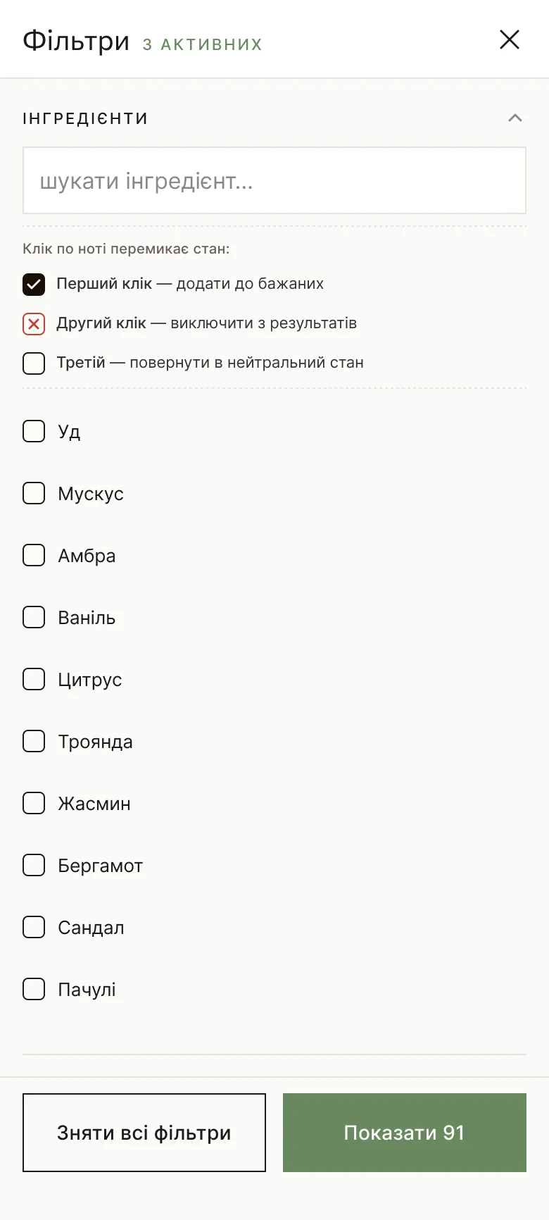
DecisionAn A–Z brand index and favourite brands; chips for gender, volume, fragrance type, concentration and season; including and excluding notes (top, heart, base); a price per ml range.

Old filters: a long closed list of brands and more dropdowns below it.
Before: closed dropdowns
New mobile filters: an A–Z brand index, favourite brands and a short brand list.
After: brands A–Z and favourites
New mobile filters: ingredients that switch between include, exclude and neutral with each tap.
After: include or exclude notes

A product page that explains the scent

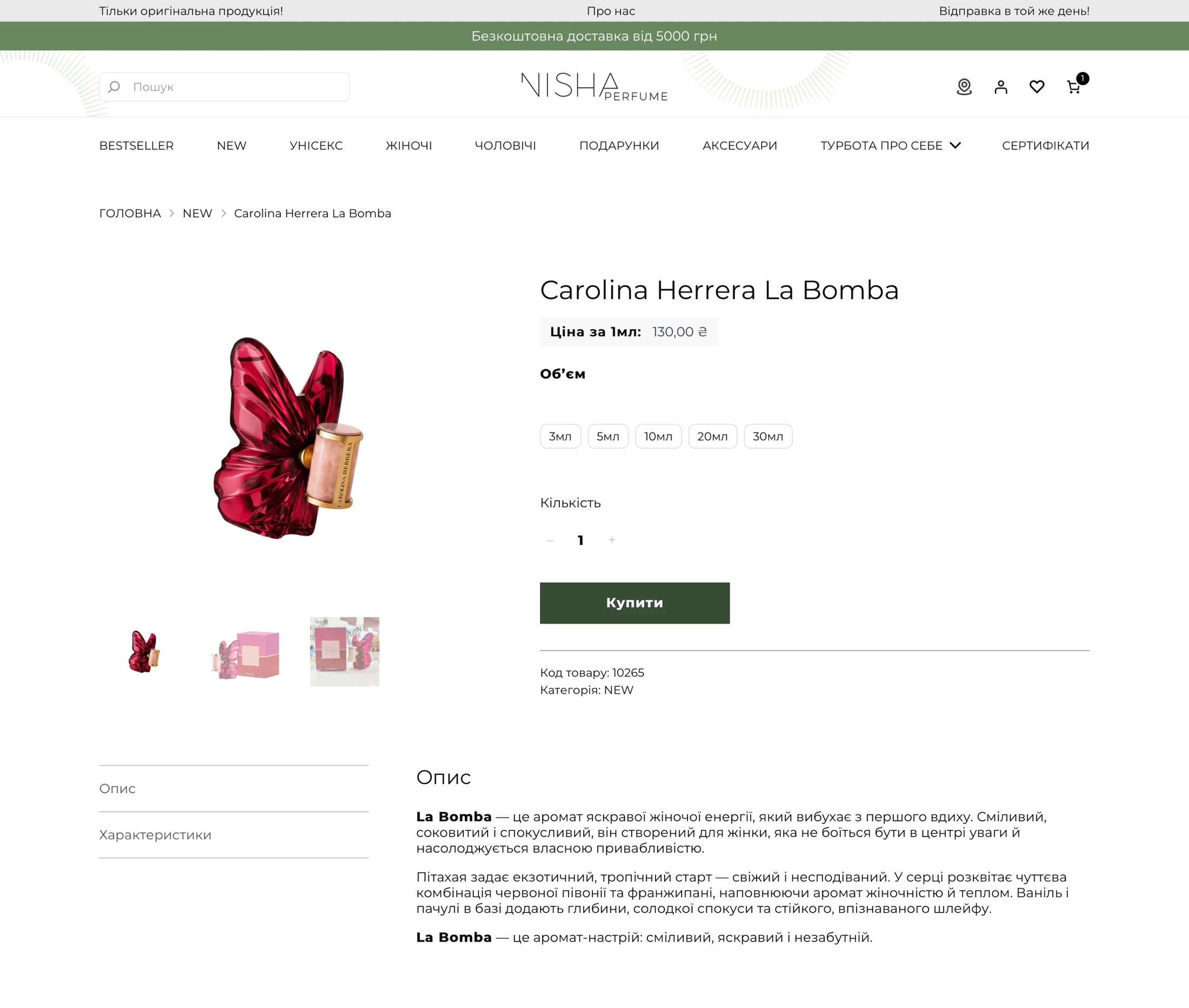
ProblemPeople couldn’t tell how a perfume smells or how long it lasts before buying.

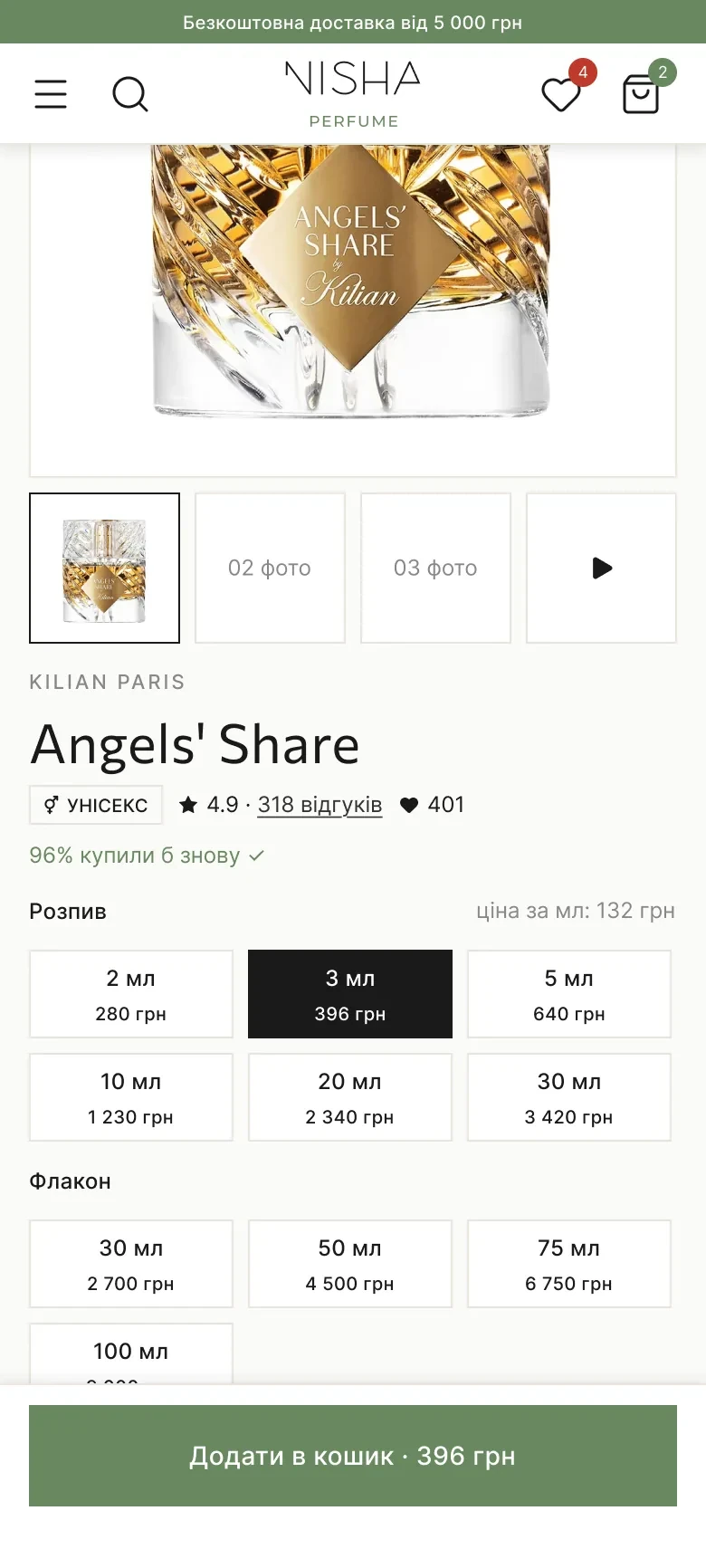
DecisionA note pyramid in plain words, longevity and sillage scales, “96% bought again”, reviews that show the purchased volume, and a sticky buy bar on mobile.

The old Nisha product page: a photo, the price per ml, volume buttons from 3 to 30 ml and a Buy button, with a plain description below.
Before: the old product page
Product page for Angels' Share on desktop: volumes, price per ml, add to cart and the note pyramid.
Product page, desktop
Product page for Angels' Share on mobile: volume picker with 3 ml selected and a sticky add-to-cart bar.
Mobile

Checkout in three steps

ProblemA long checkout without a clear end.

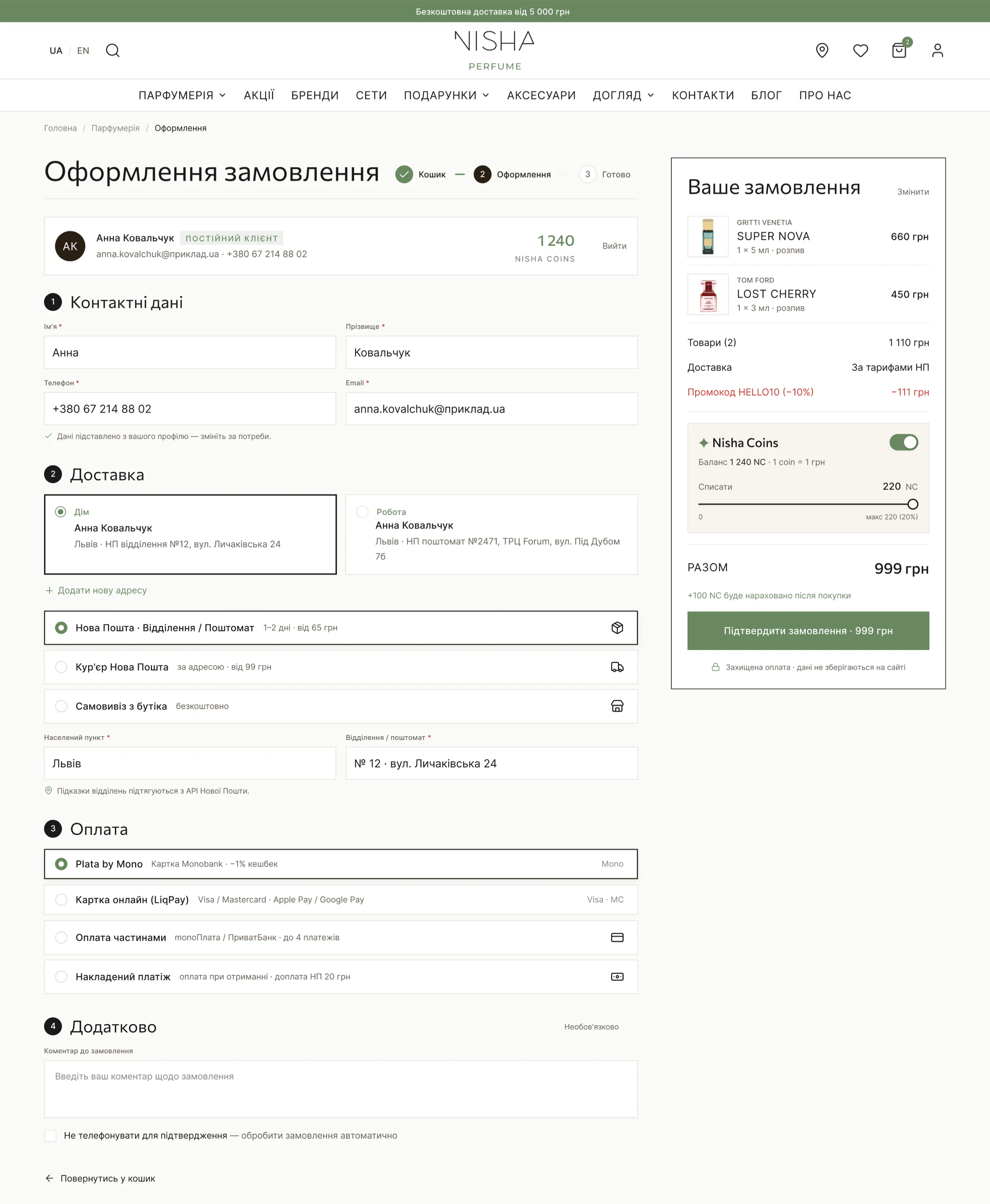
DecisionCart, Checkout, Done, with the summary always in view; saved Home and Work addresses; Nisha Coins with one toggle and a slider; monobank, cards, Apple and Google Pay, instalments and cash on delivery.

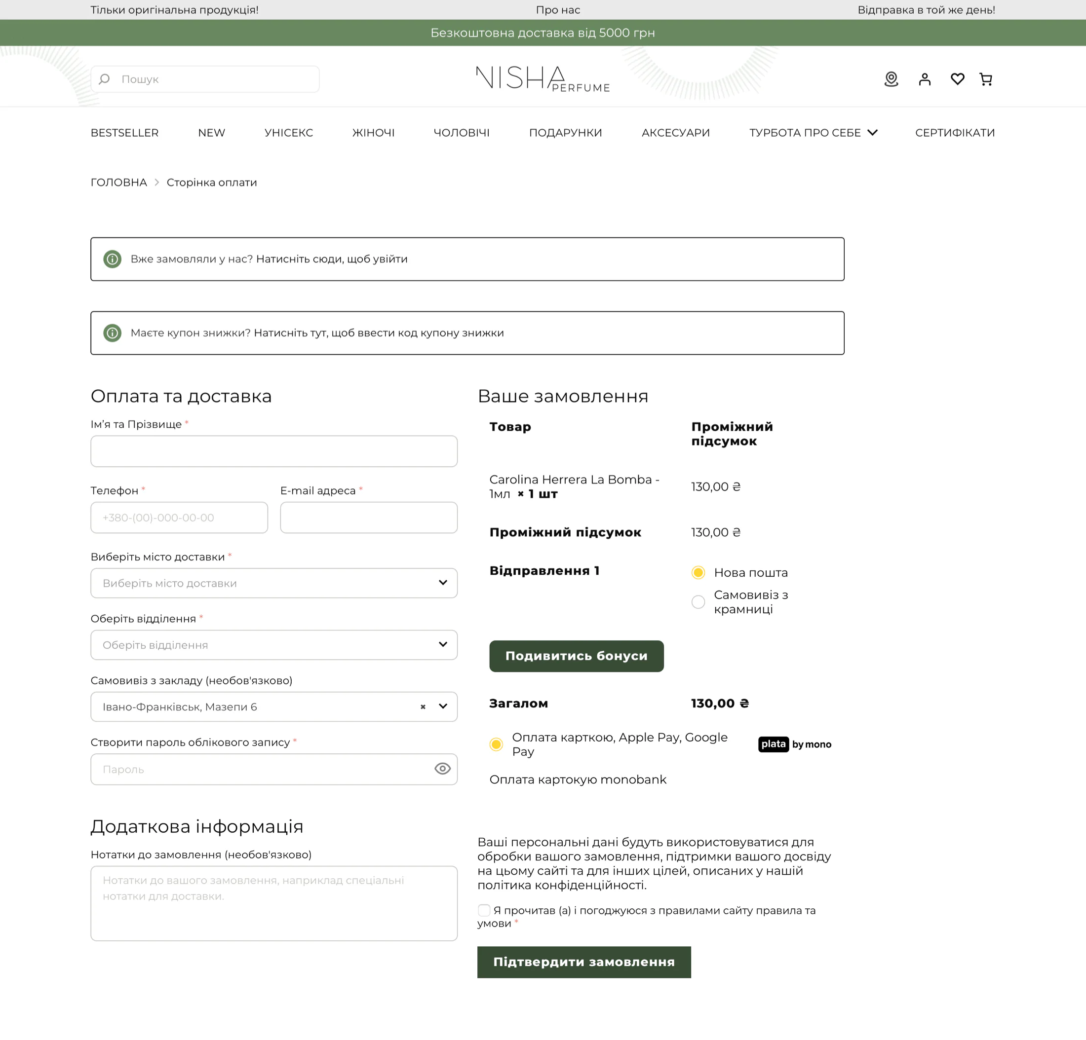
The old Nisha checkout: one long form with name, phone, email, city and branch, and a short order summary on the side.
Before: the old checkout
Checkout for a signed-in customer: contact details, saved addresses, delivery, payment and an order summary with Nisha Coins.
Checkout with the summary always in view

Build your own set

ProblemPeople ordered perfume sets through Instagram: they had to write which scents they wanted, how many millilitres and how many vials.

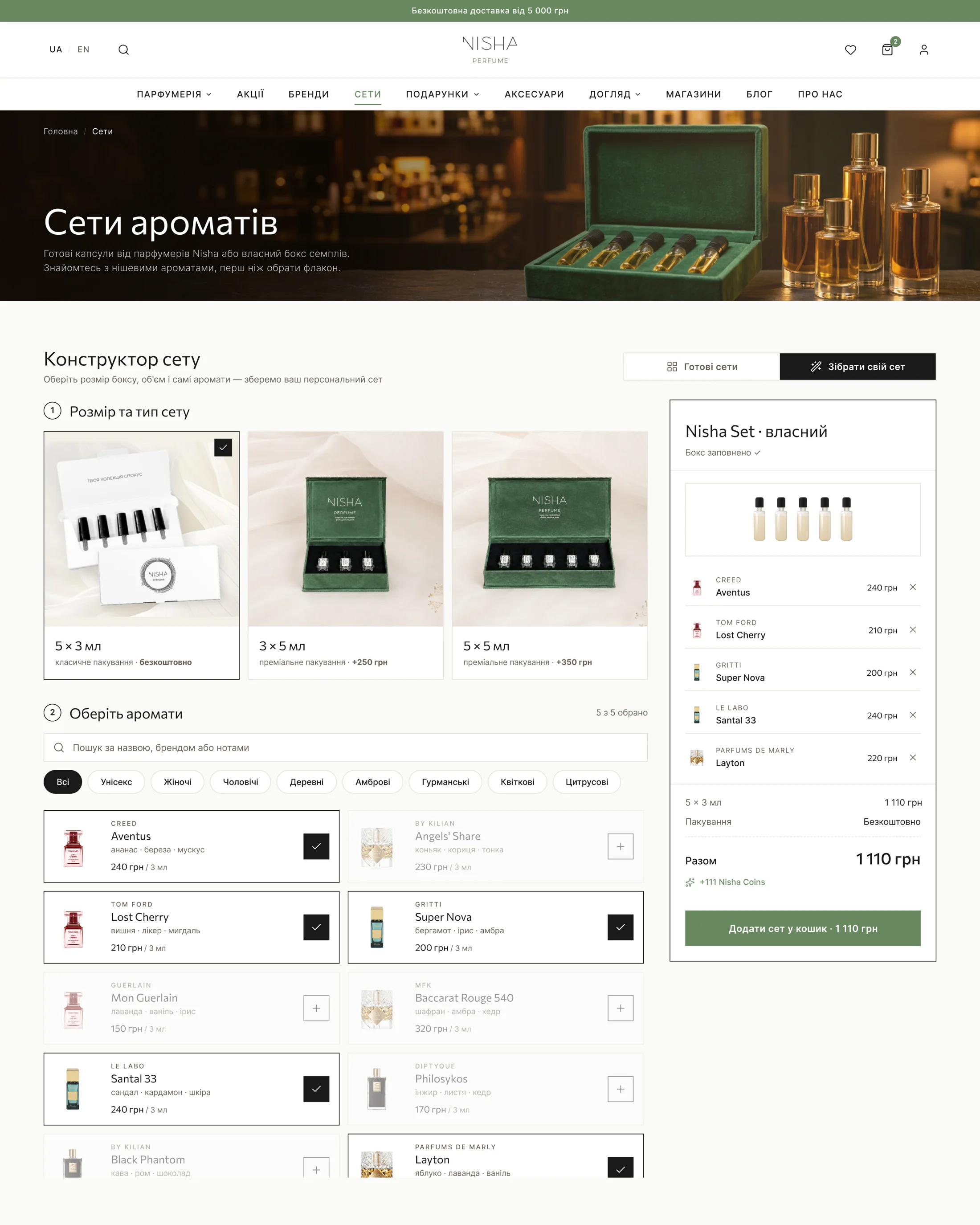
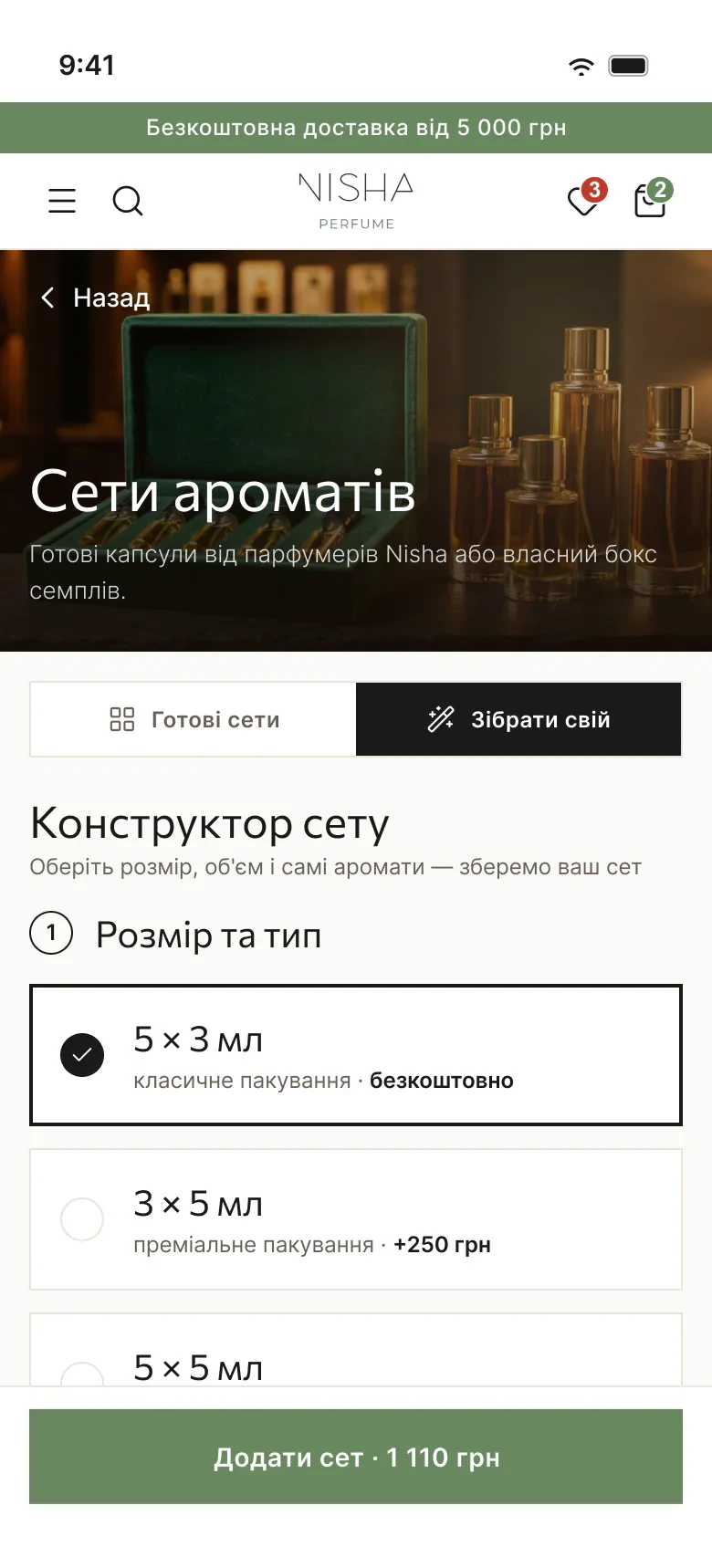
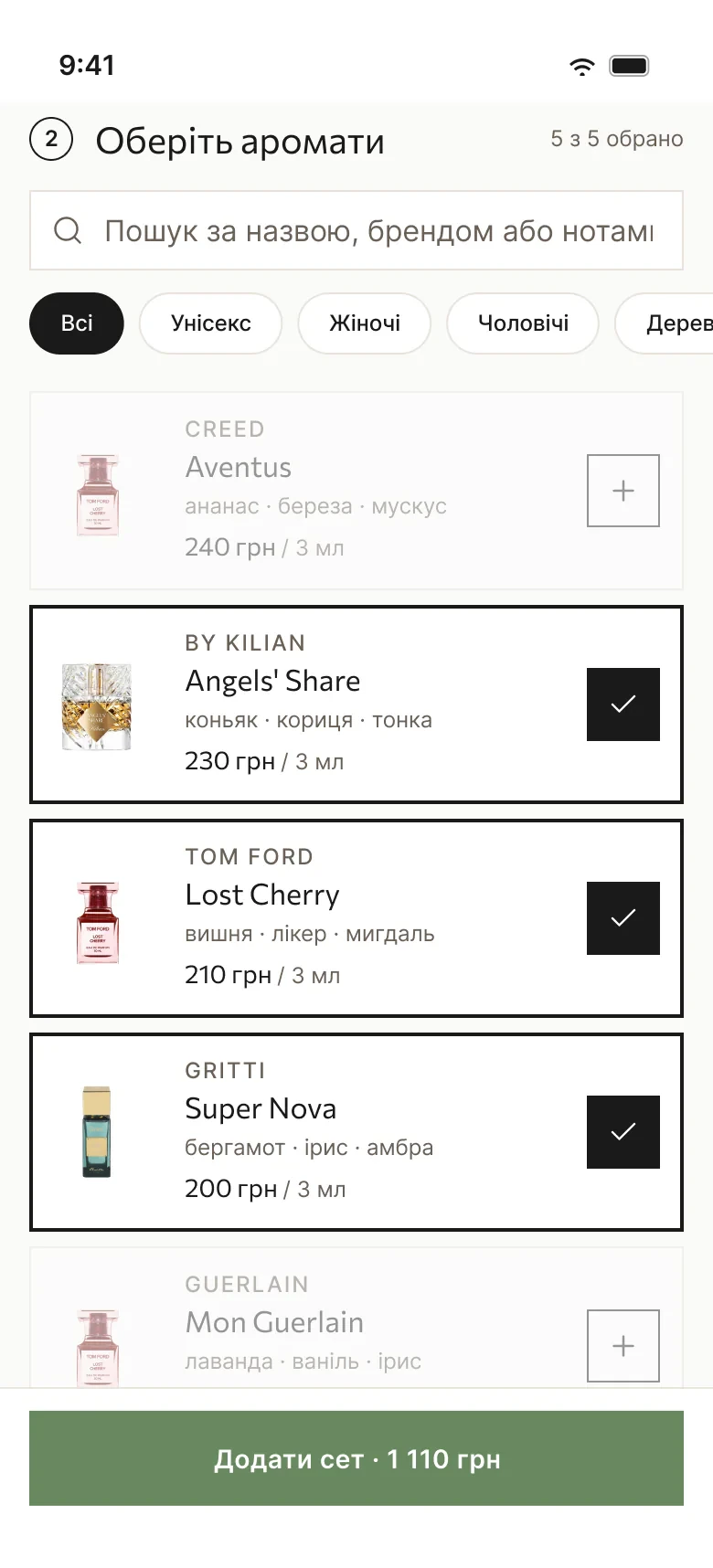
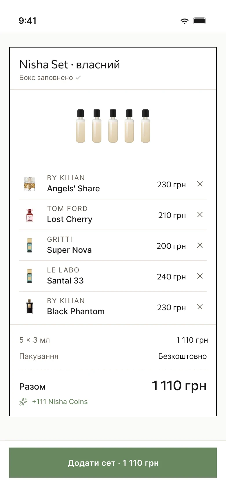
DecisionA set builder on the website, a new feature the client asked for and we designed together. Pick a box (5 × 3 ml, 3 × 5 ml or 5 × 5 ml), add scents with search and filters, and the set summary with the total updates as you go.

Set builder on desktop: three box options with photos, a scent list with search and filters, and the set summary with five scents and the total price.
Set builder, desktop
Set builder on mobile, step 1: box size and type, with a sticky “Add set” button and the price.
1. Box
Set builder on mobile, step 2: scent search, filter chips and a list with selected scents checked.
2. Scents
Set builder on mobile: the set summary with five scents, packaging and the total.
3. Set summary

Mobile app

A store that knows you

The iOS and Android app adds what a website can’t: a personal feed, gifts and loyalty in one place.

A short quiz, then a personal feed

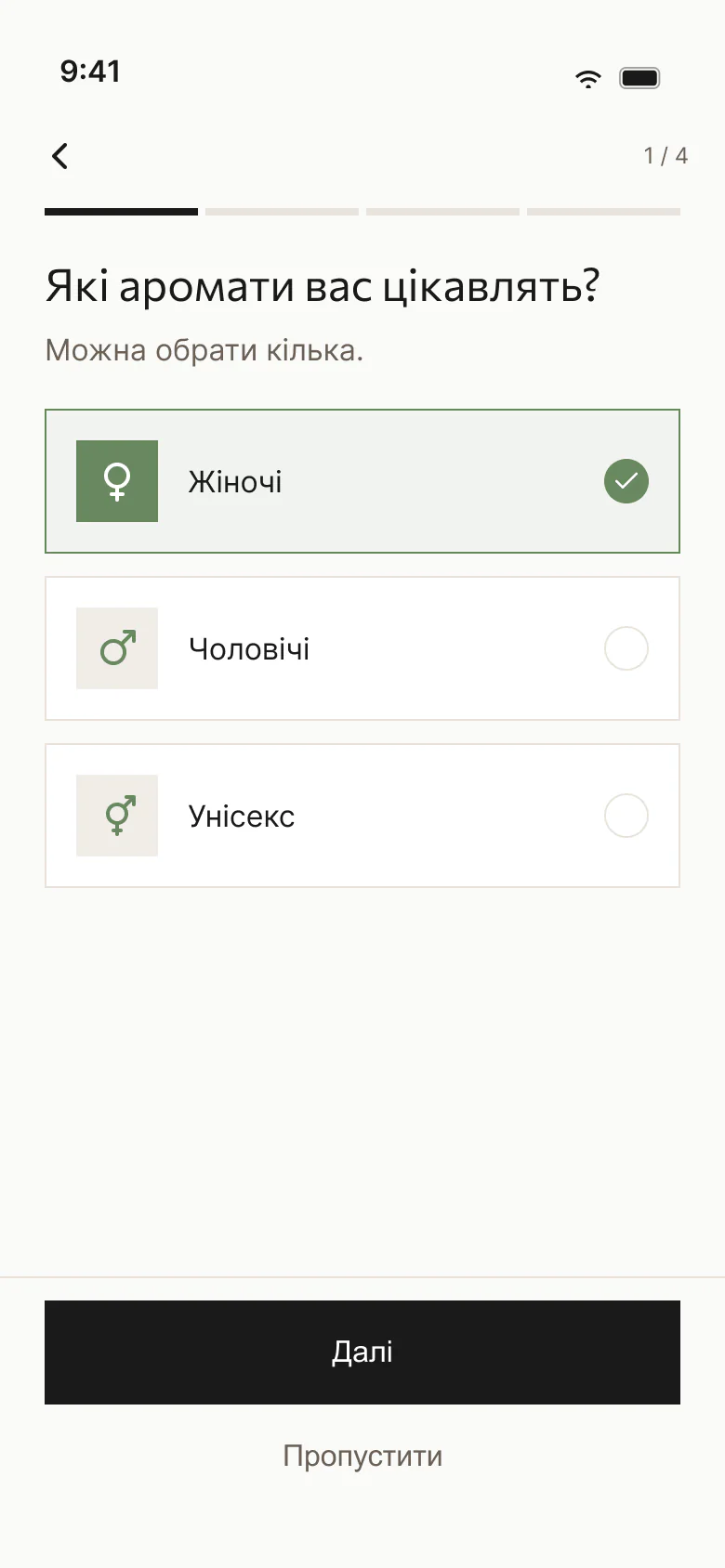
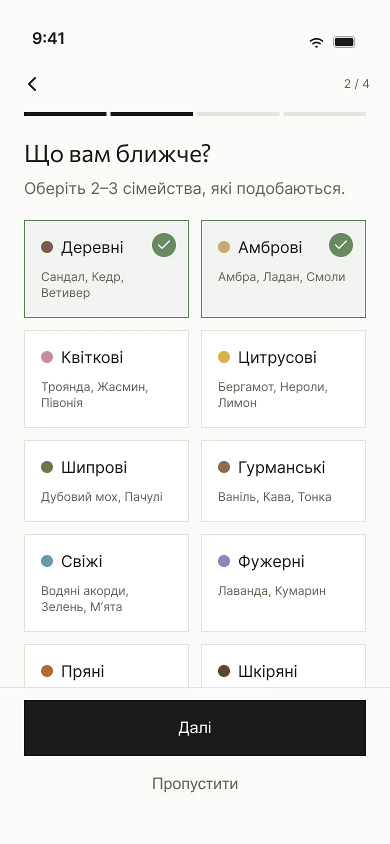
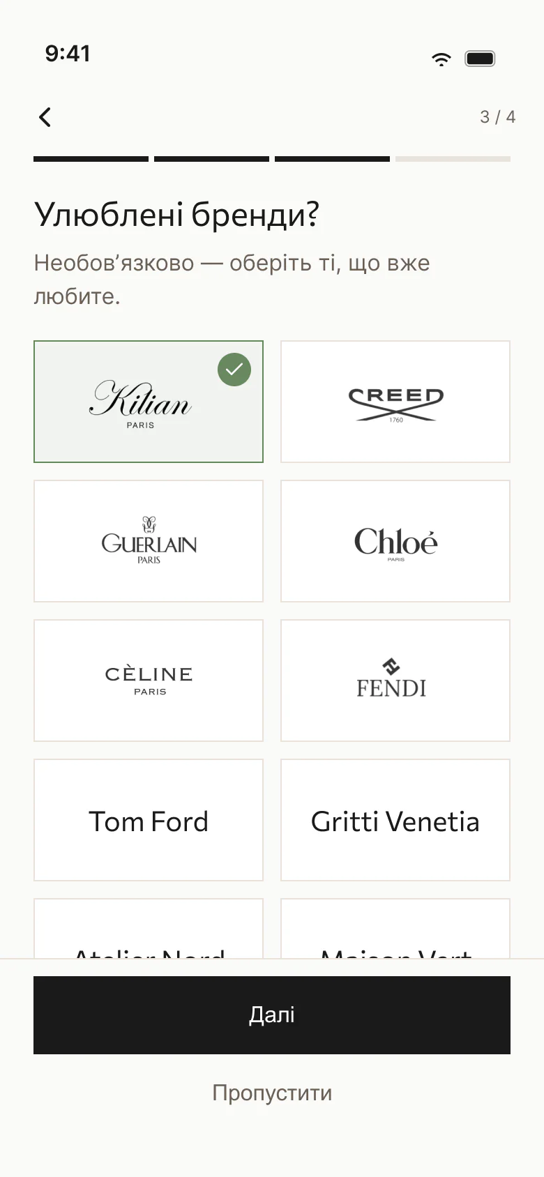
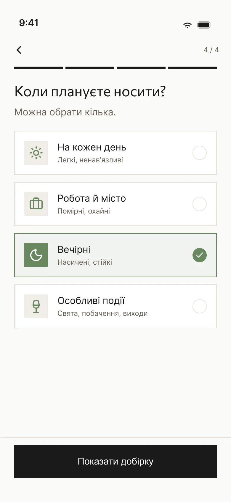
Four quick steps: which scents, which families, favourite brands and when you plan to wear them. The app then picks scents for that taste and opens the “Specially for you” feed.

Quiz step 1 of 4: women’s, men’s or unisex scents.
1. Which scents
Quiz step 2 of 4: scent families such as woody and amber, with example notes.
2. Scent families
Quiz step 3 of 4: favourite brands shown as logo tiles.
3. Favourite brands
Quiz step 4 of 4: when you plan to wear the scent.
4. When to wear
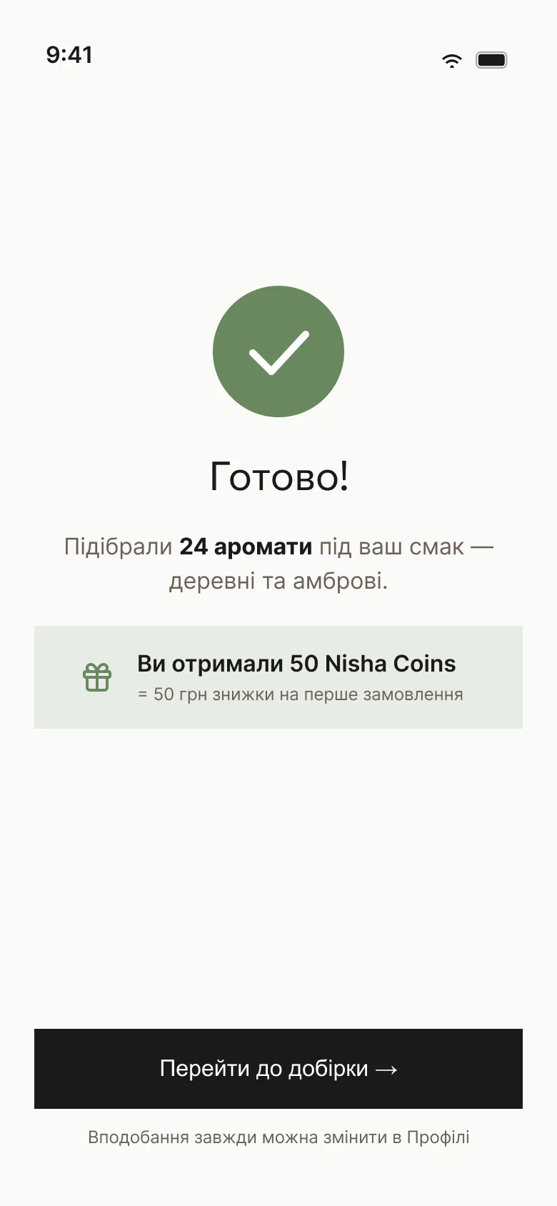
Quiz done: 24 scents picked for your taste and 50 Nisha Coins as a welcome gift.
Done: picks for your taste
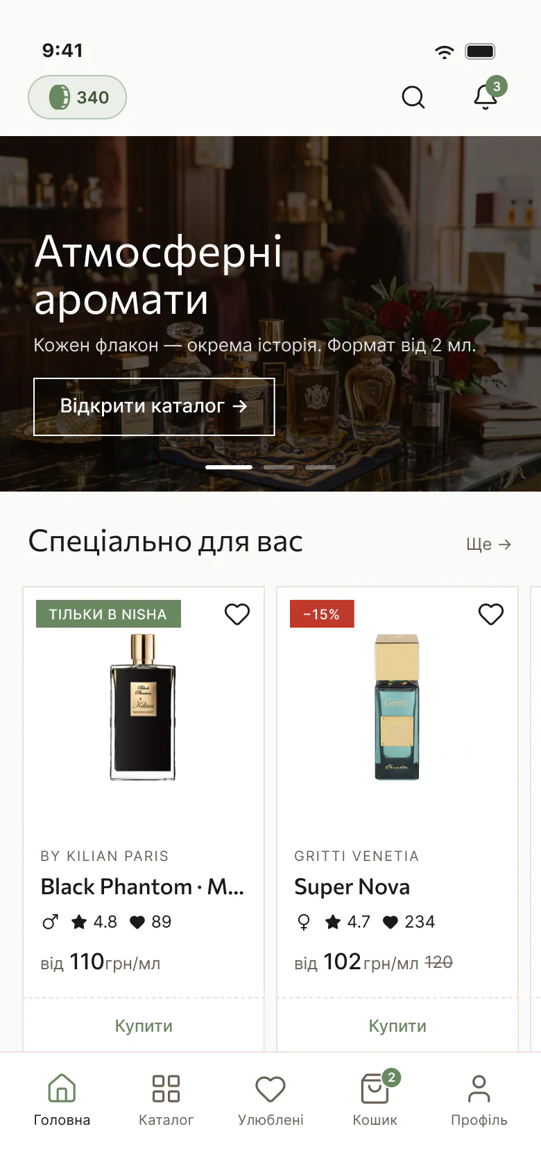
App home with the Nisha Coins balance at the top and the “Specially for you” feed.
“Specially for you” feed

Hint about a gift

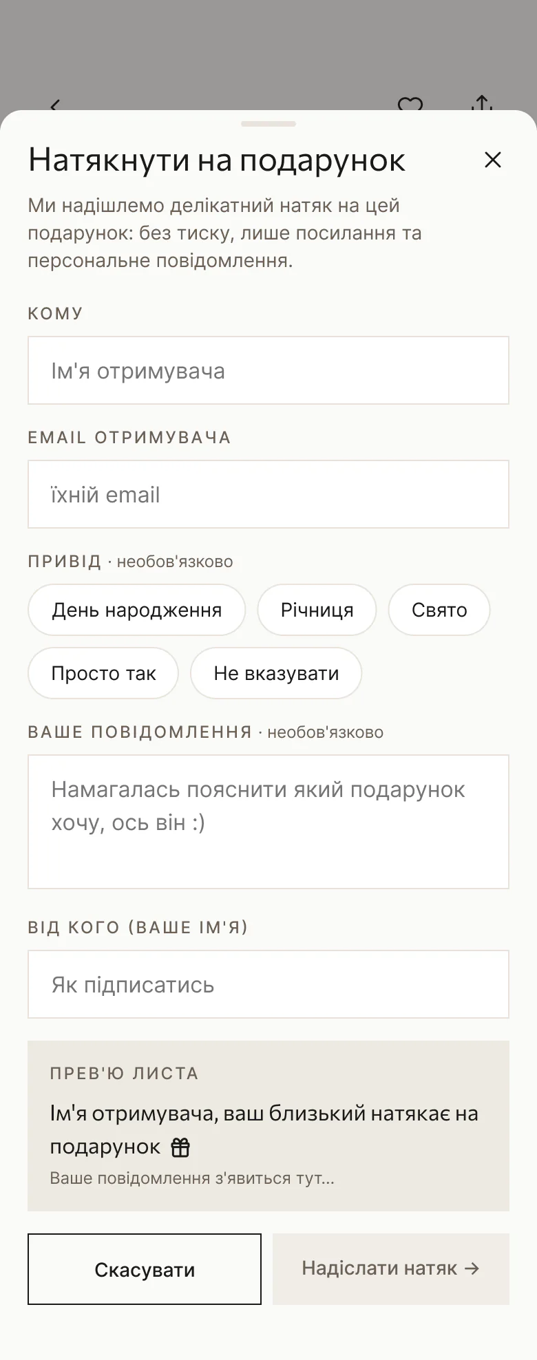
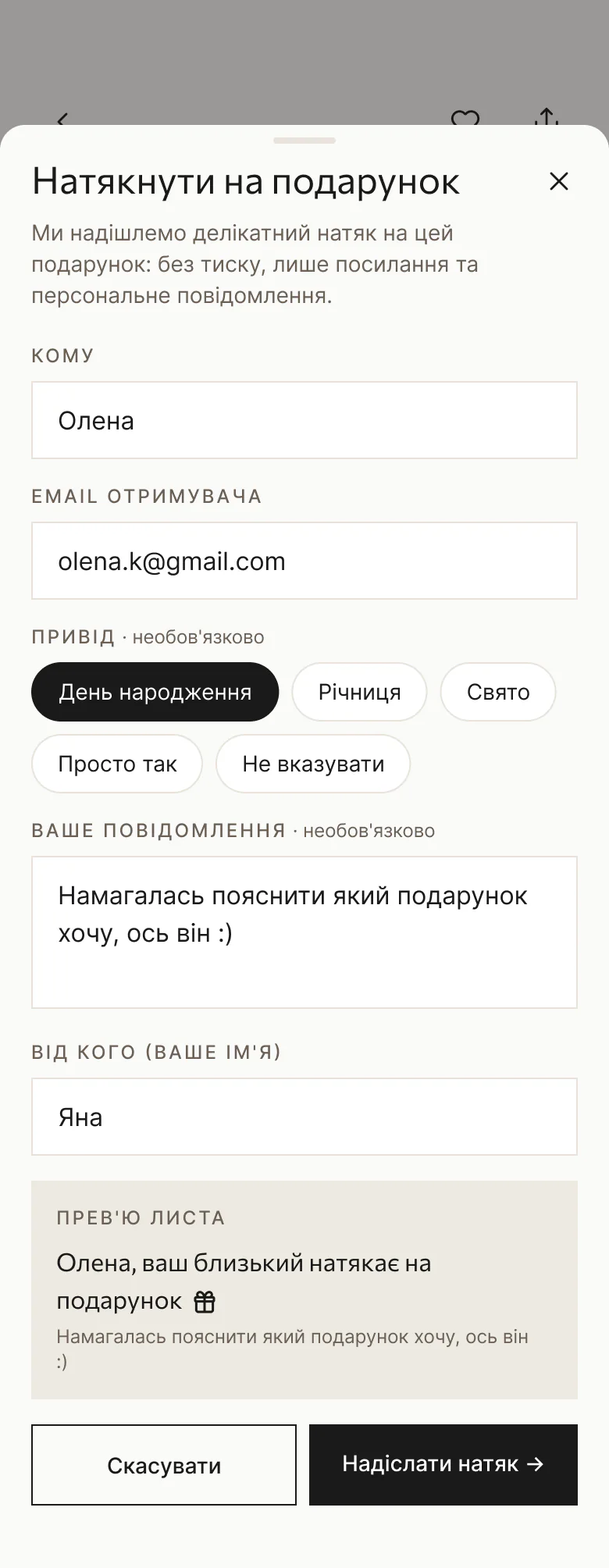
Right from the product page, people can send a partner or a friend a hint: who it’s for, their email, the occasion and a message, with a preview of the email.

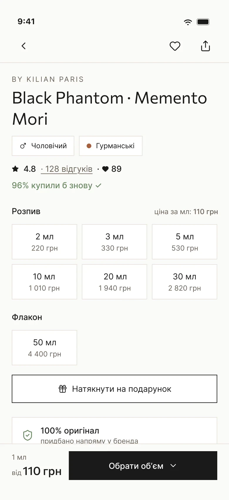
App product page for Black Phantom with volume options and the “Hint about a gift” button.
Product page with the hint button
“Hint about a gift” sheet over the product page: recipient, email, occasion, message and an email preview with a gift icon.
The hint form
The hint form filled in, with a preview of the email the recipient will get.
Filled in, with the email preview

Design system

One system for web, iOS and Android

I built it from scratch together with Claude: one set of tokens and components for the website and the iOS and Android app.

Foundations

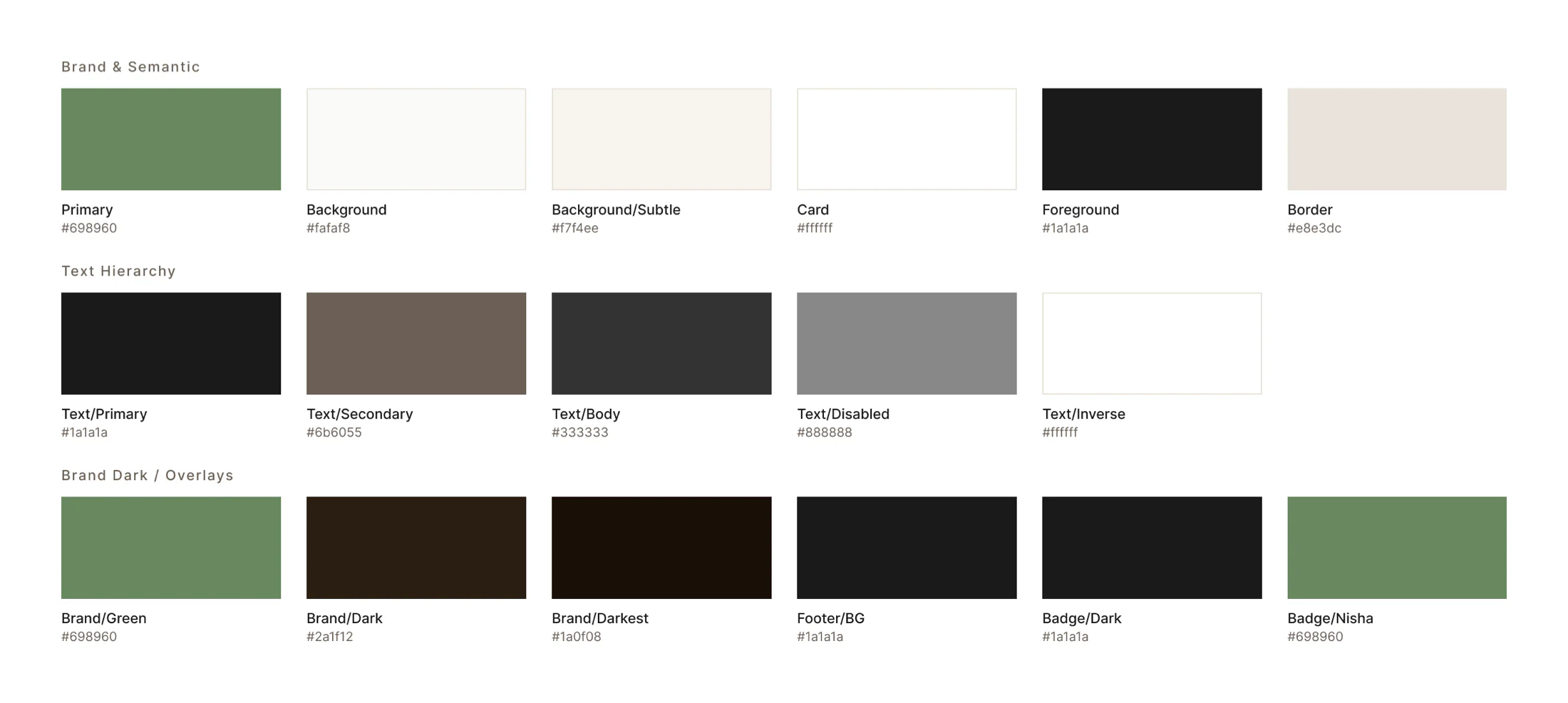
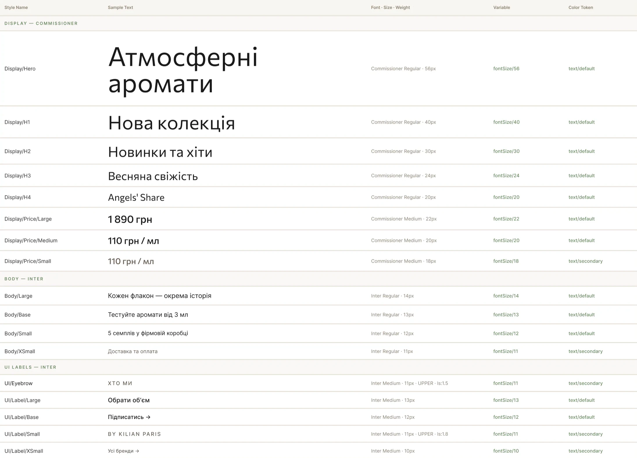
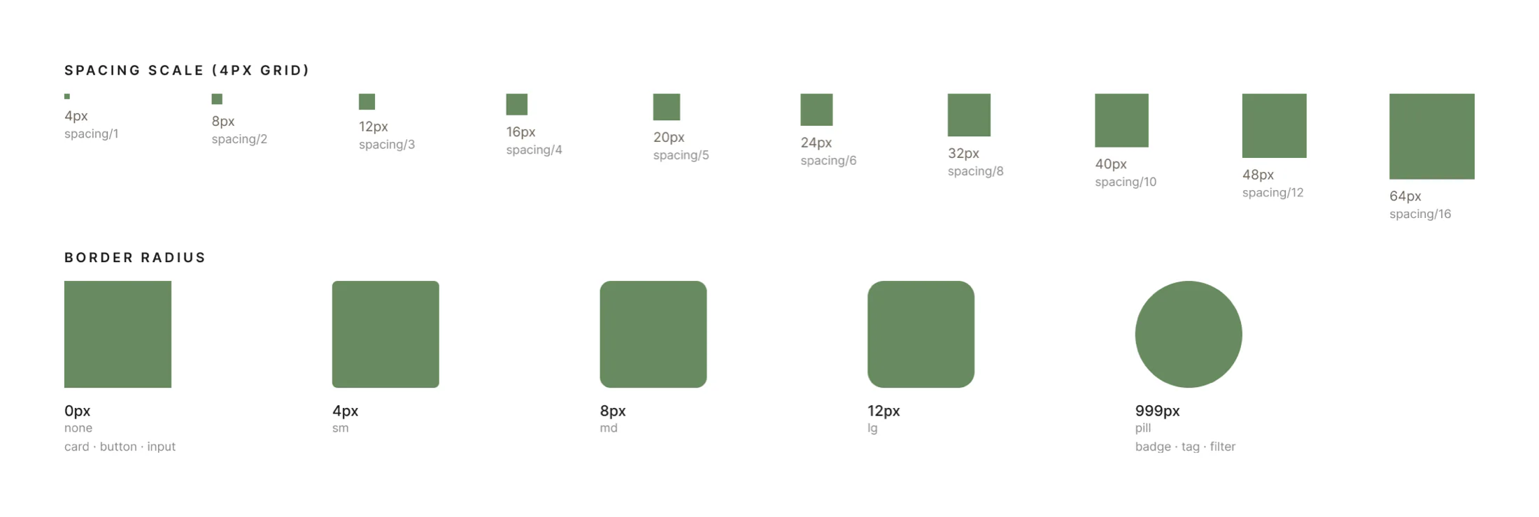
Color, type and spacing tokens: a green accent on warm neutrals, Commissioner for headings and prices, Inter for the interface, and spacing on a 4 px grid.

Nisha color tokens: brand and semantic colors, text hierarchy and dark brand colors, each with its hex value.
Color tokens
Nisha type scale: Commissioner display styles and Inter body and interface styles, with sizes and token names.
Type scale
Spacing scale on a 4 px grid from 4 to 64 px, and corner radii from 0 to pill.
Spacing and radii

Every component in every state

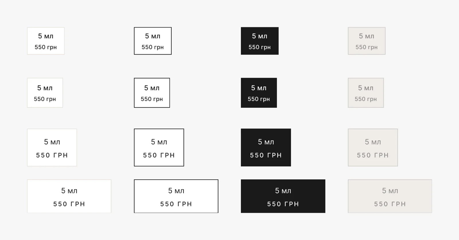
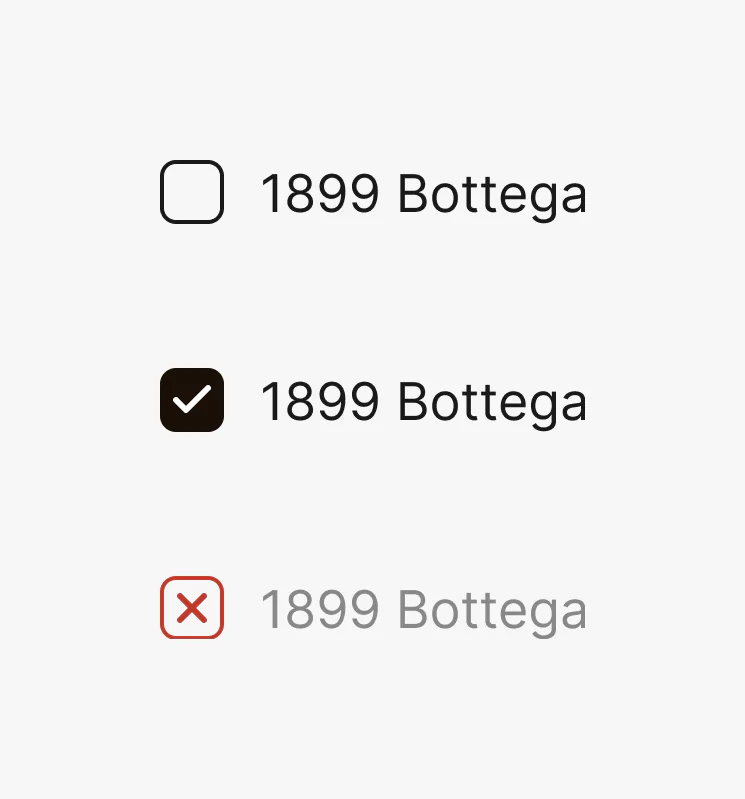
Components are drawn in all their states and sizes. The volume picker has default, hover, selected and disabled in four sizes; the note filter has a third state, exclude.

Volume picker component in four states (default, hover, selected, disabled) and four sizes.
Volume picker: 4 states × 4 sizes
Note filter checkbox in three states: off, on and excluded.
Note filter: off, on, excluded

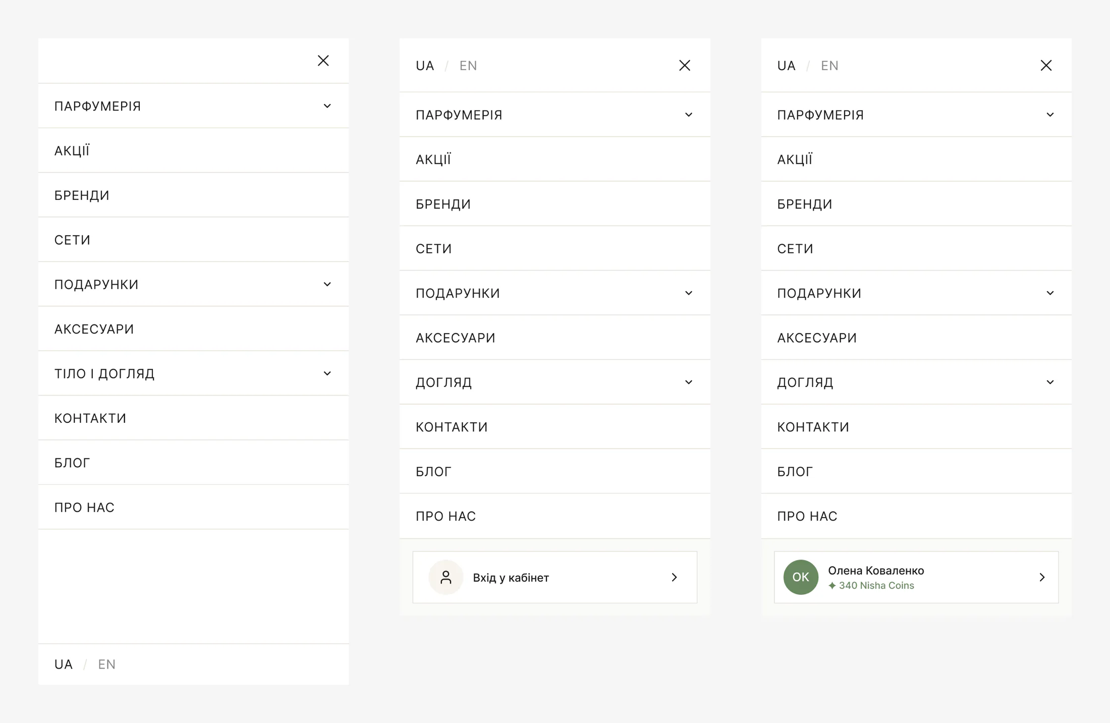
One system for the website and the app

The same mobile menu works in three versions: in the app, for a guest on the website and for a signed-in customer with their Nisha Coins.

Mobile menu component in three versions: app, website guest and signed-in customer with a Nisha Coins balance.
Mobile menu: app, guest, signed in

Ready for developers

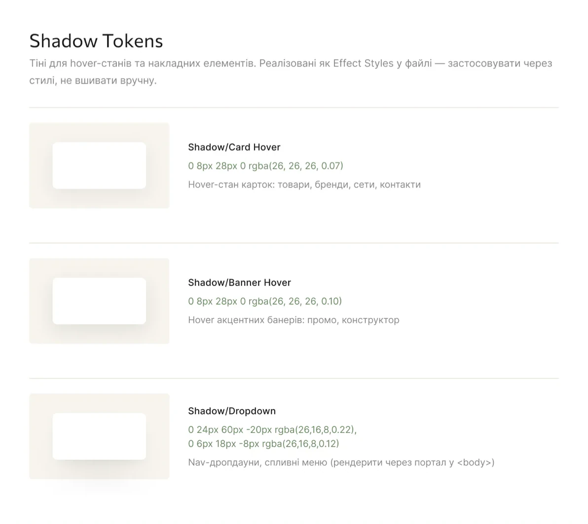
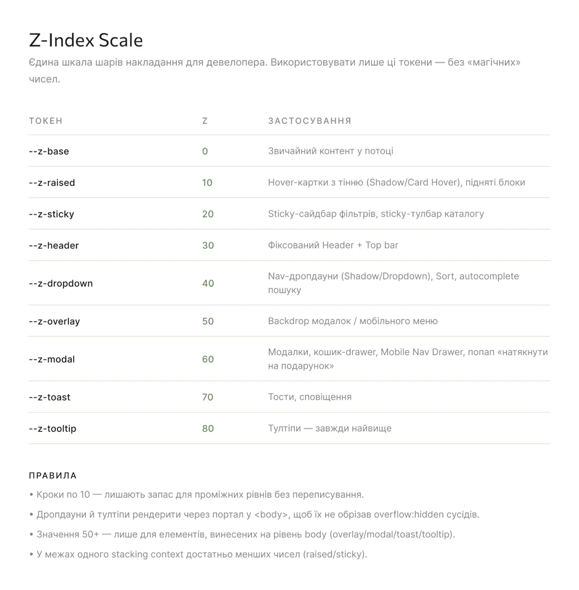
Shadow and z-index scales with clear rules, so developers use tokens instead of “magic” numbers.

Shadow tokens for card hover, banner hover and dropdowns, with values and where to use them.
Shadow tokens
Z-index scale from base to tooltip in steps of 10, with rules for developers.
Z-index scale and rules

Status

Website released

The new website went live in November 2026. The team is still building the app.

Get in touch