One question per screen
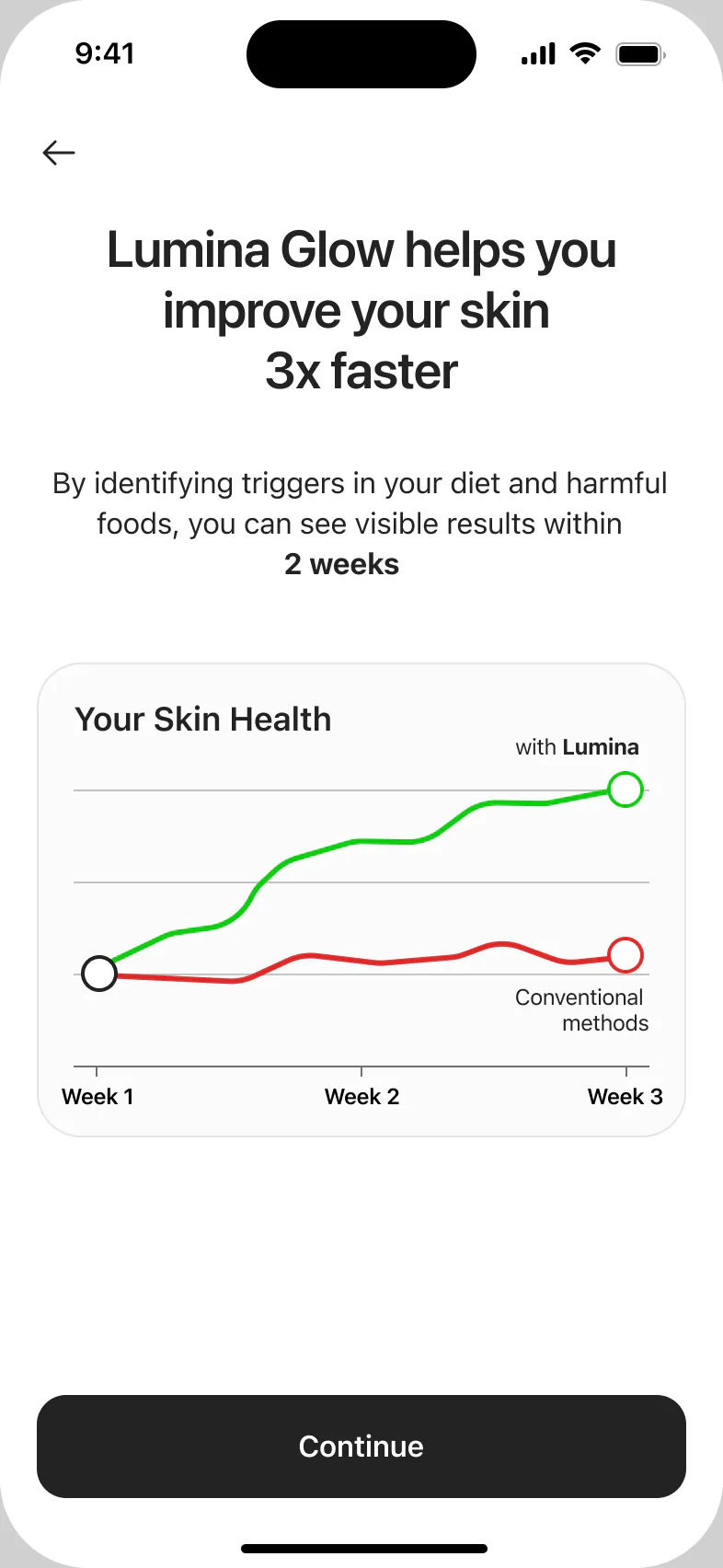
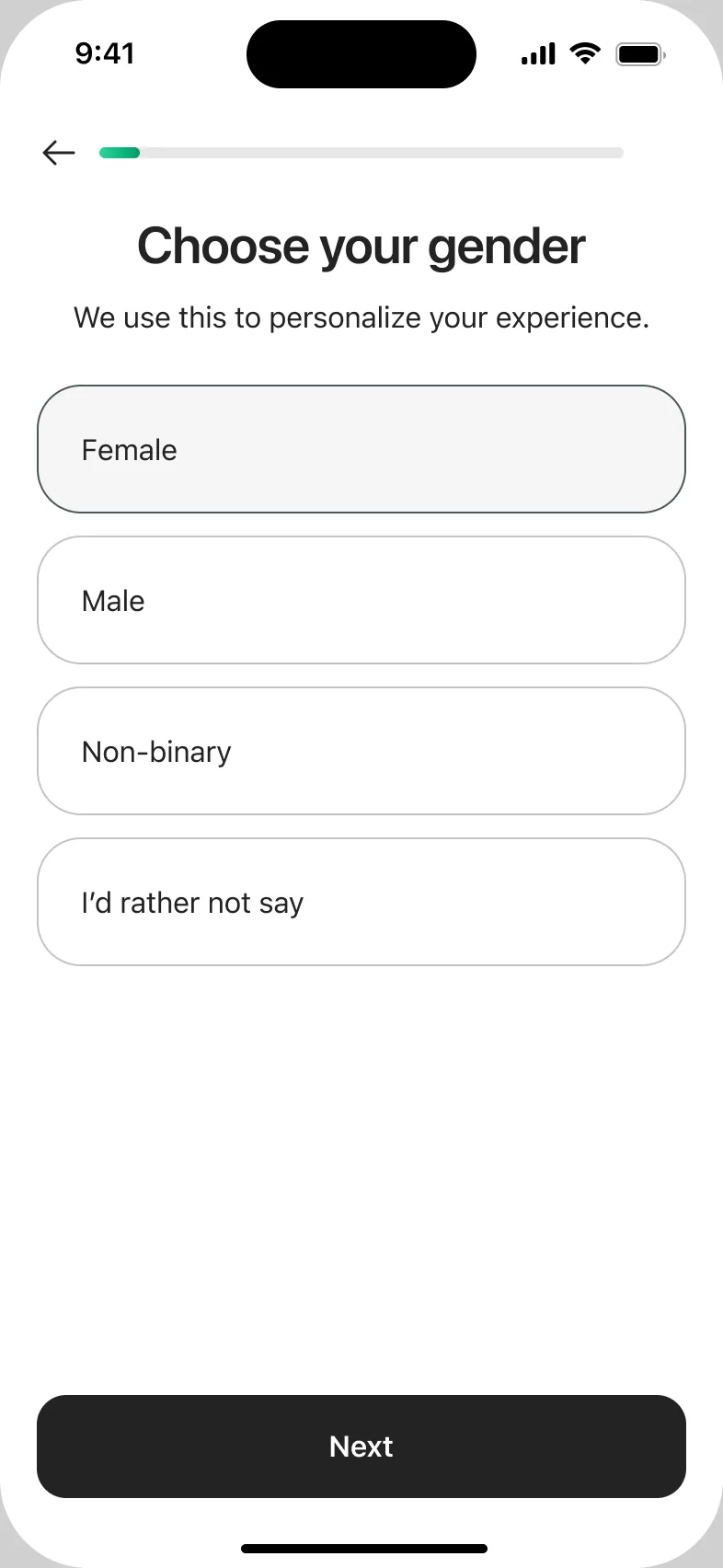
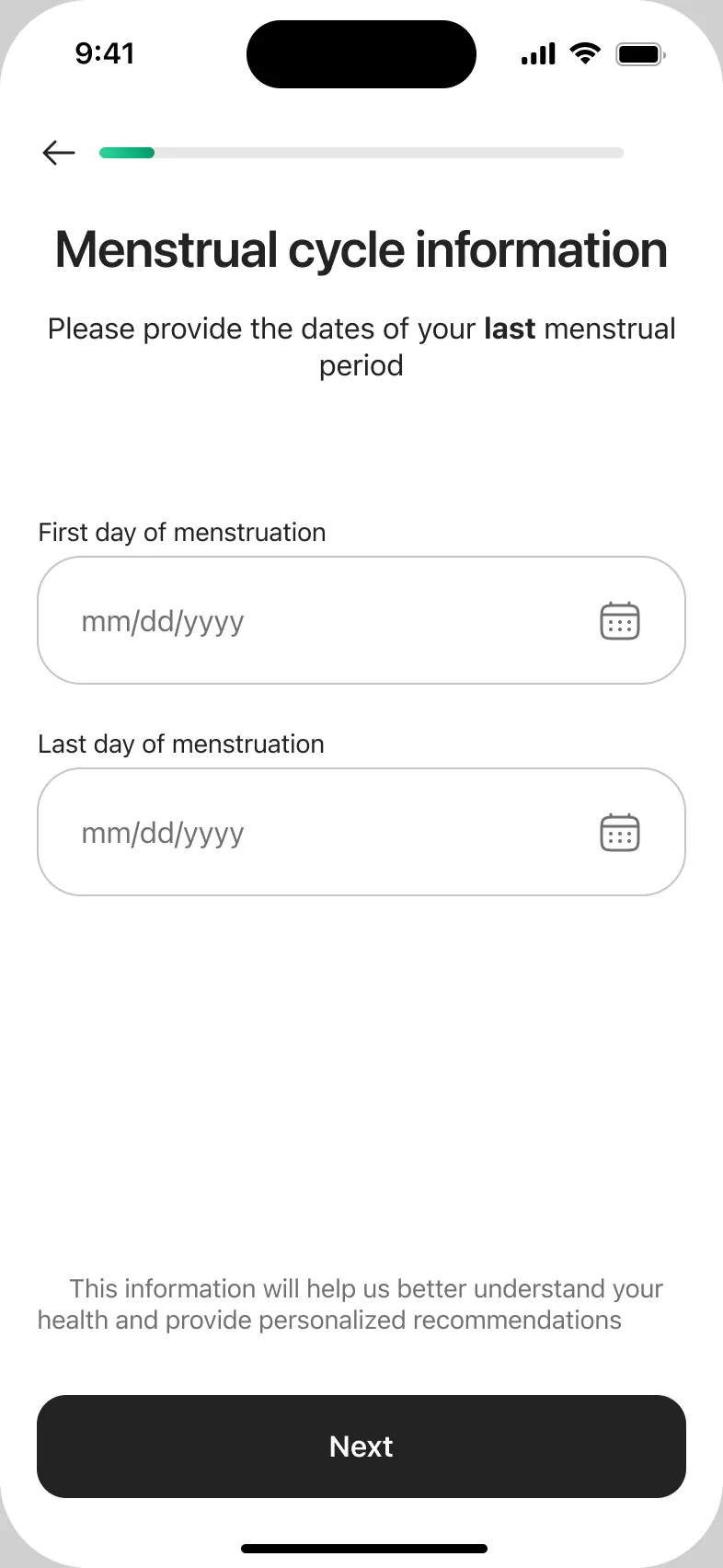
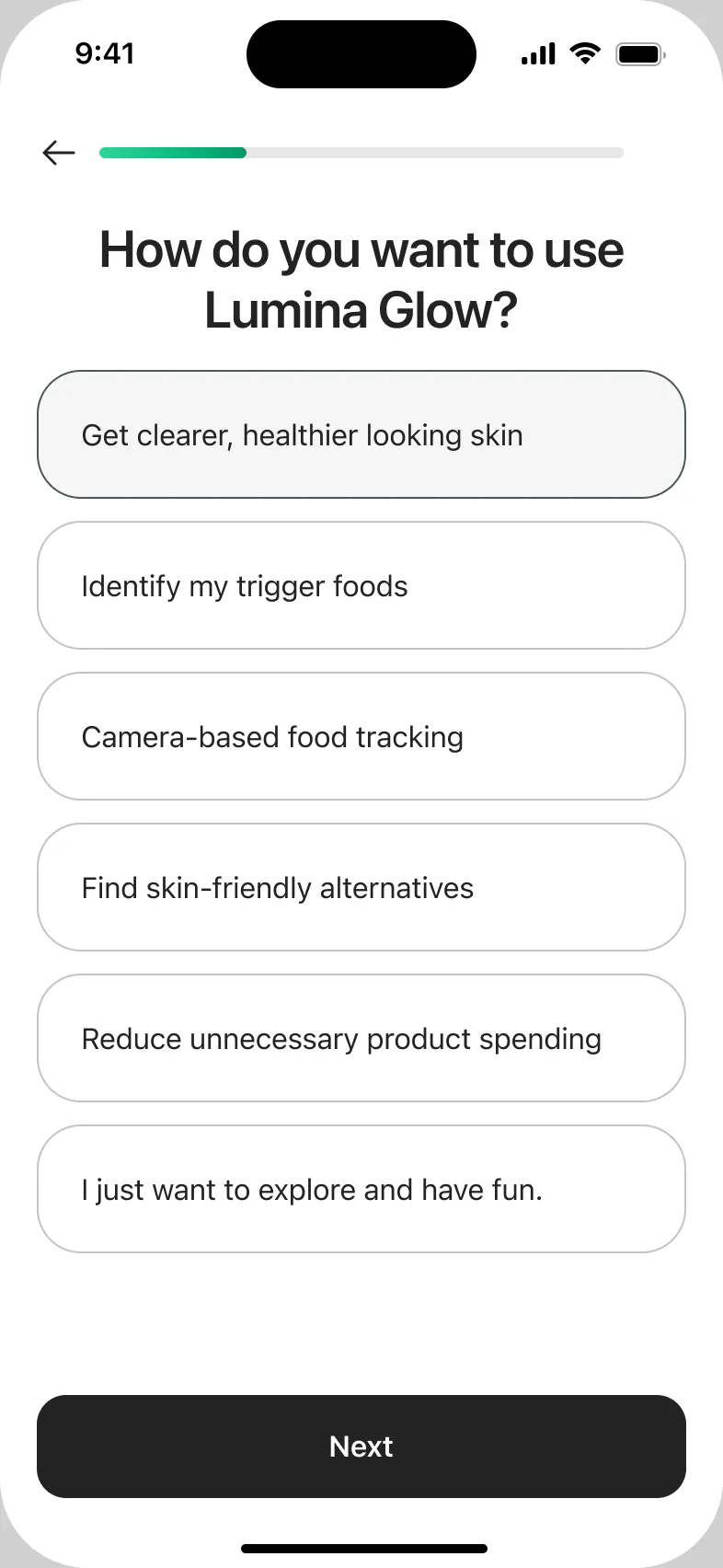
A progress bar, one action and a short “why we ask” under sensitive questions. The name and goals come back later in the personal plan.
Case study · 2025
An app that shows how food affects your skin: scan your face and your meals, and follow your skin week by week.

The task
Lumina Glow helps people understand how what they eat shows up on their skin. Before the app can help, it needs to know a lot about the person.
The goal was to make a long onboarding personal and worth going through, so people reach their plan:
How I worked
I was the only designer on the project. The client came with wireframes and early ideas; I designed the UI and improved the flows.
Key decisions
Six parts of one flow, from the first question to the trial.
A progress bar, one action and a short “why we ask” under sensitive questions. The name and goals come back later in the personal plan.
Before the camera: why the photo is needed and how it is stored. Tips for a good photo: bright light, no filters, no makeup. The scan becomes the current skin score and a target, so progress has a goal.
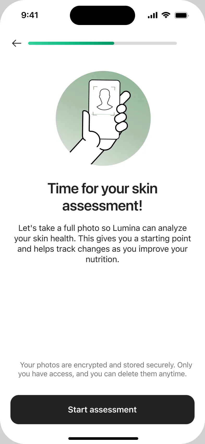
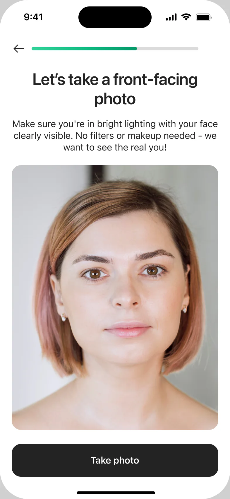
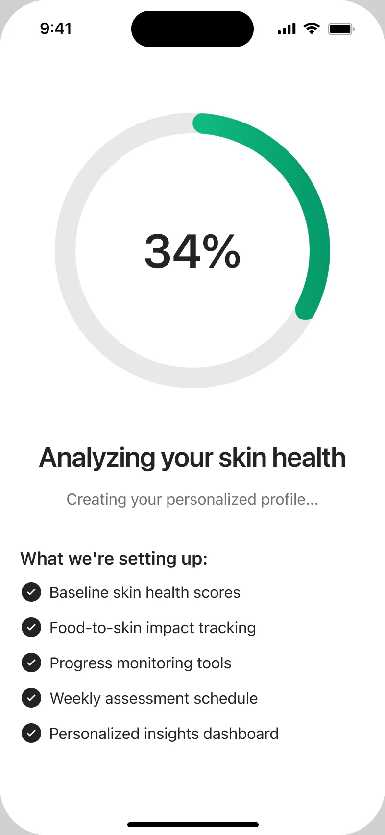
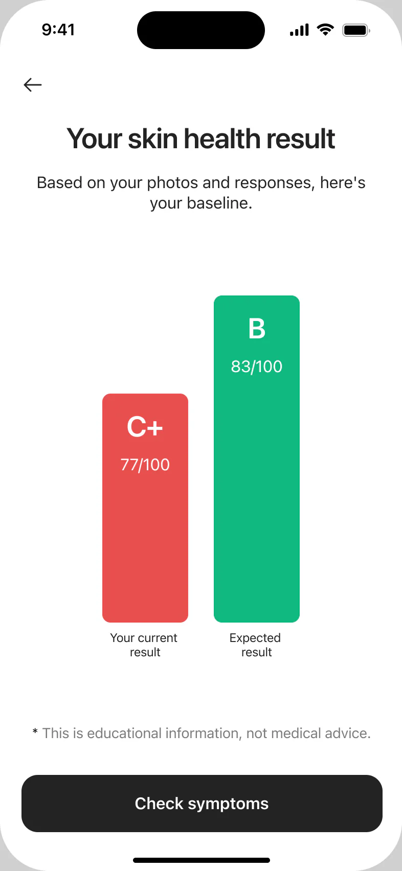
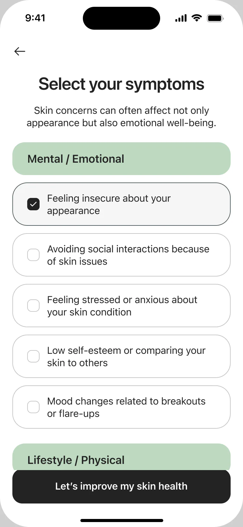
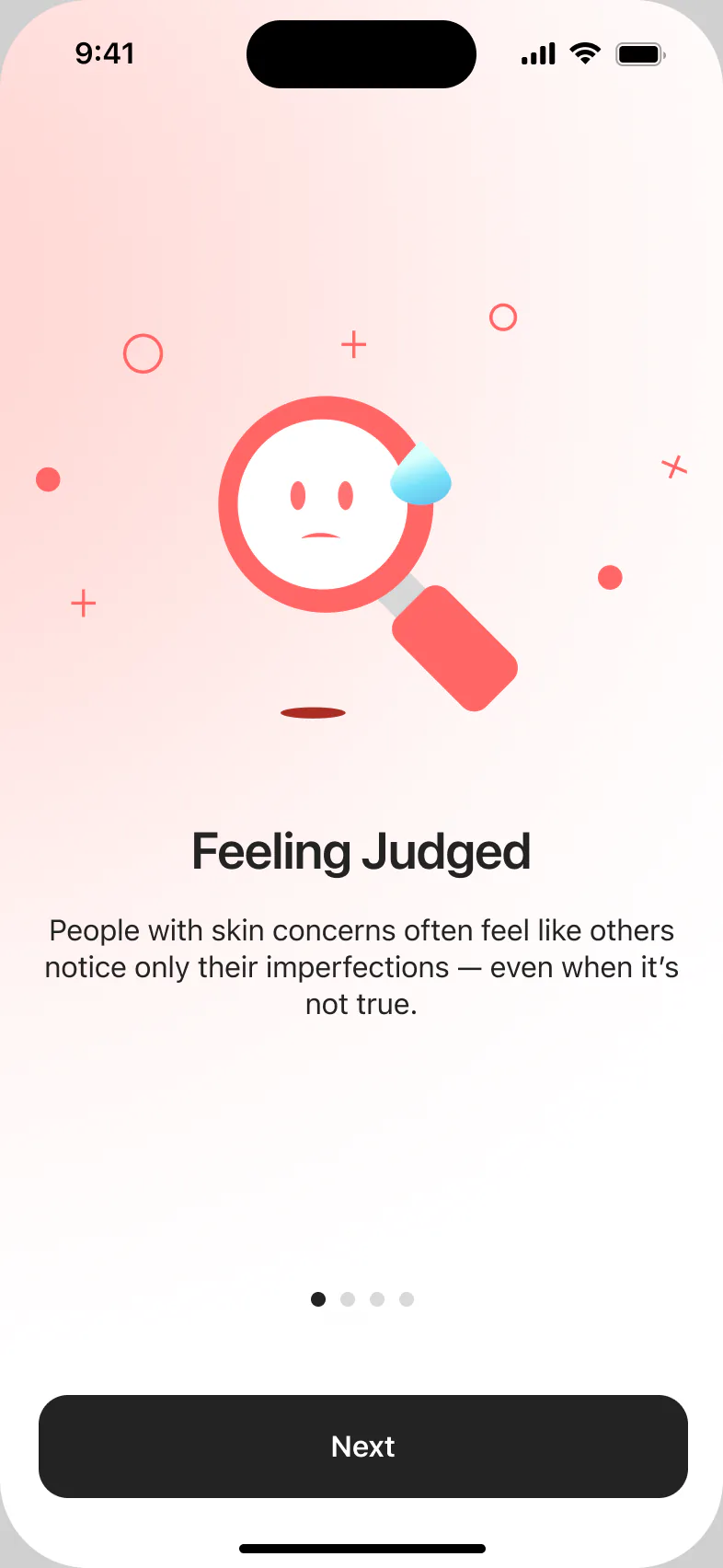
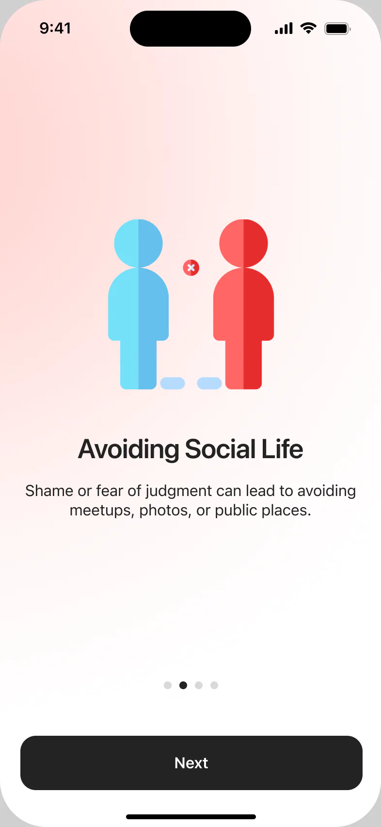
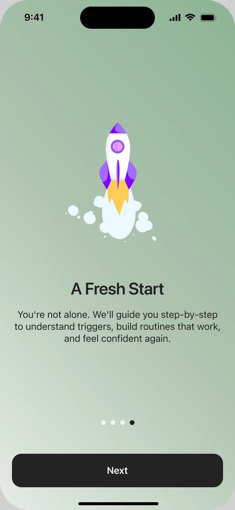
Symptoms include feelings, not only skin: being judged, avoiding social life, stress. Every pain has a positive answer. Soft pink for the problem, the calm brand green for the solution.
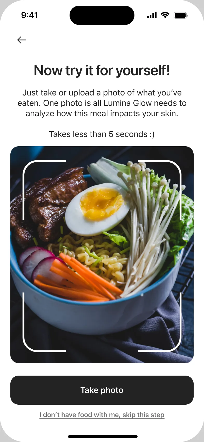
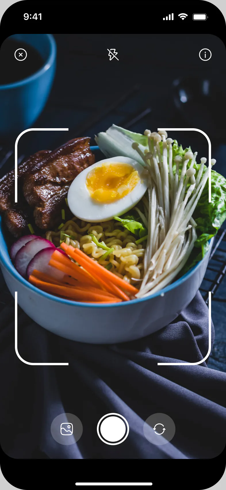
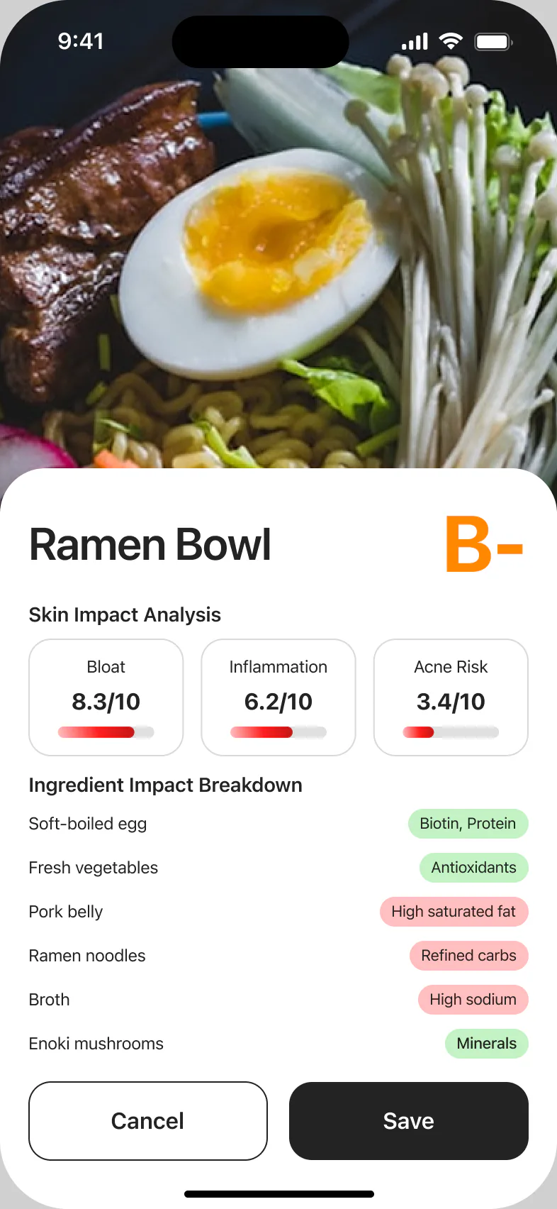
A letter grade, three skin risks with scales, and every ingredient marked as good or bad. People can scan their first meal during onboarding or skip it.
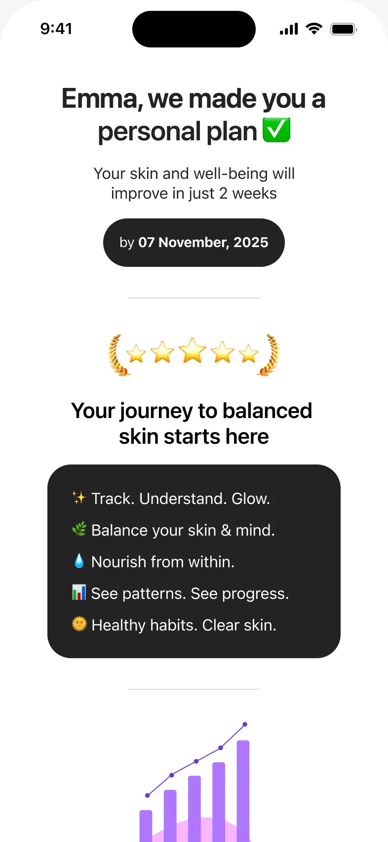
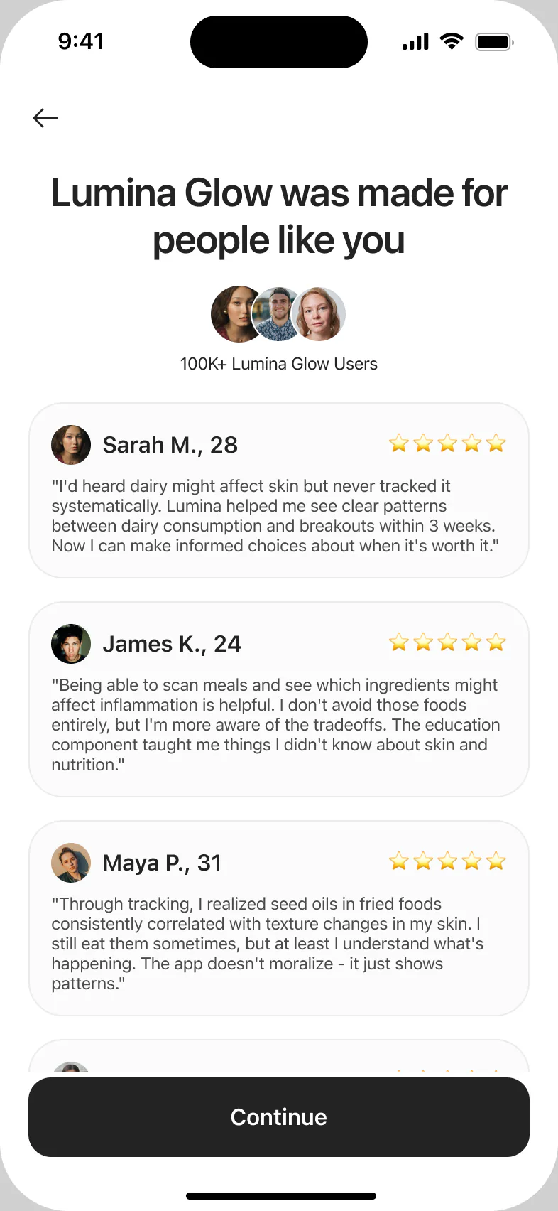
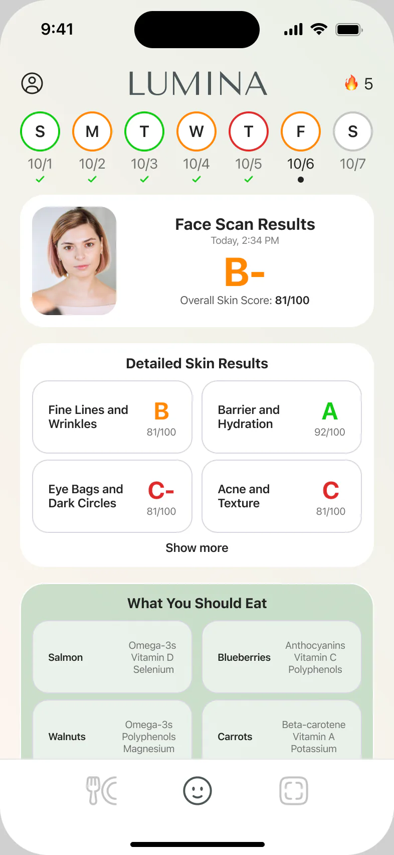
A personal plan with a target date, reviews from people like you, and a daily dashboard with a weekly streak, face scan results by zone and what to eat.
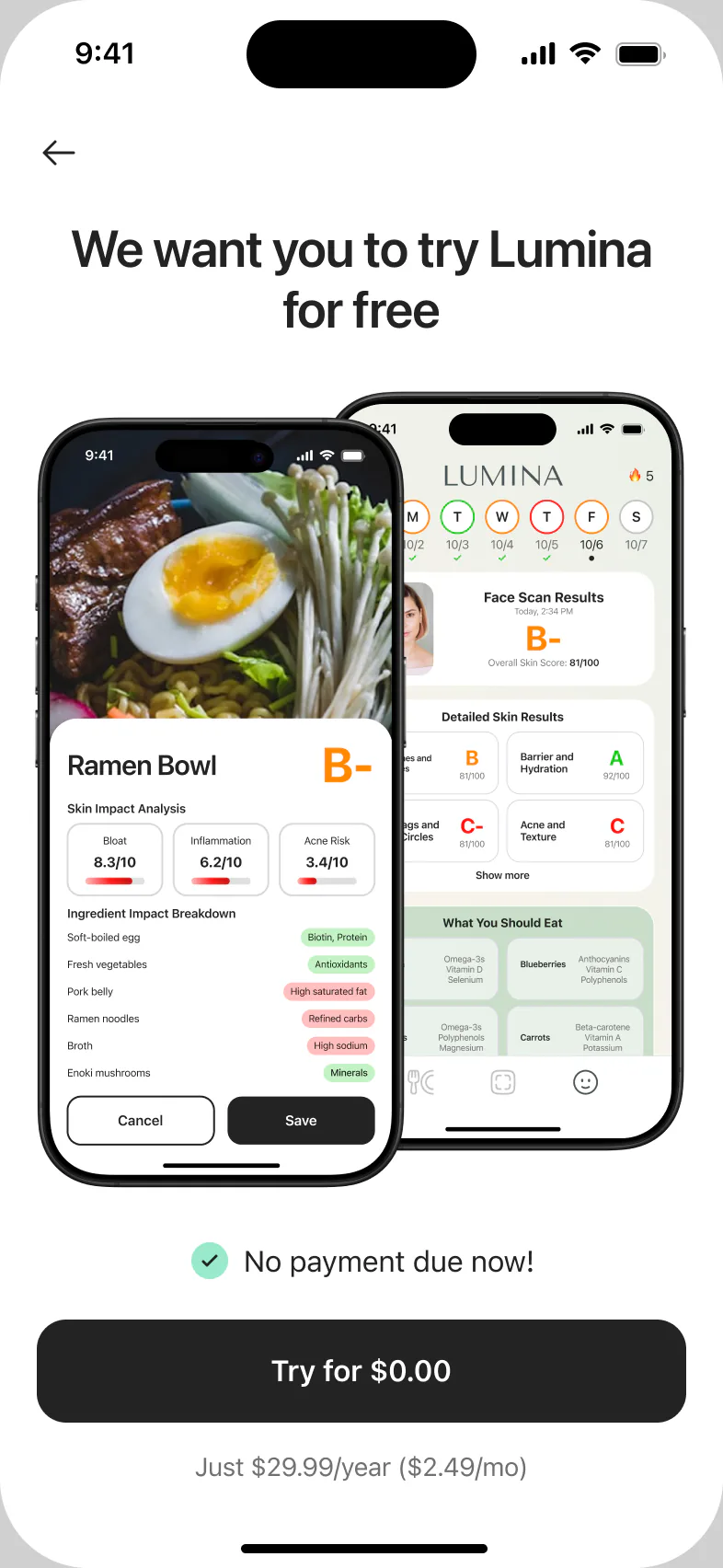
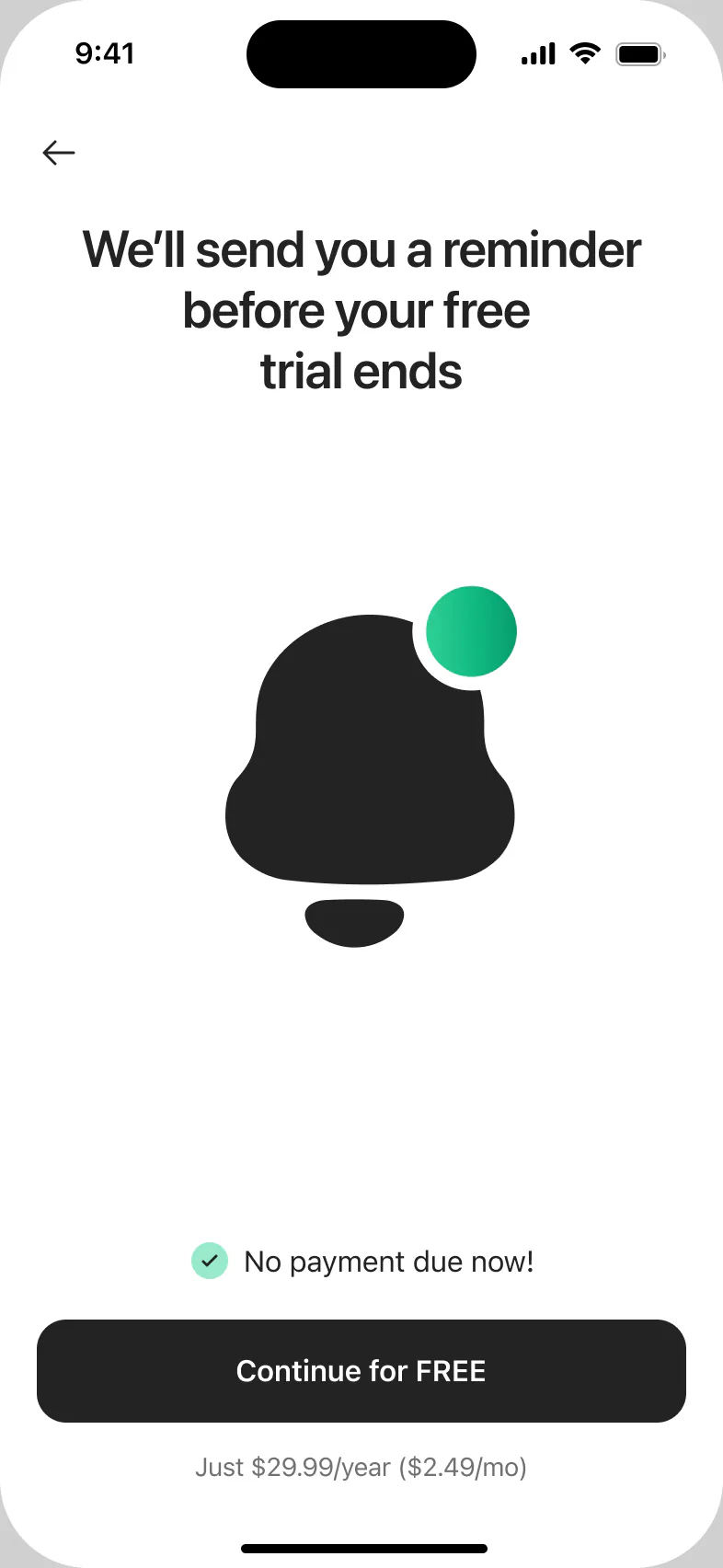
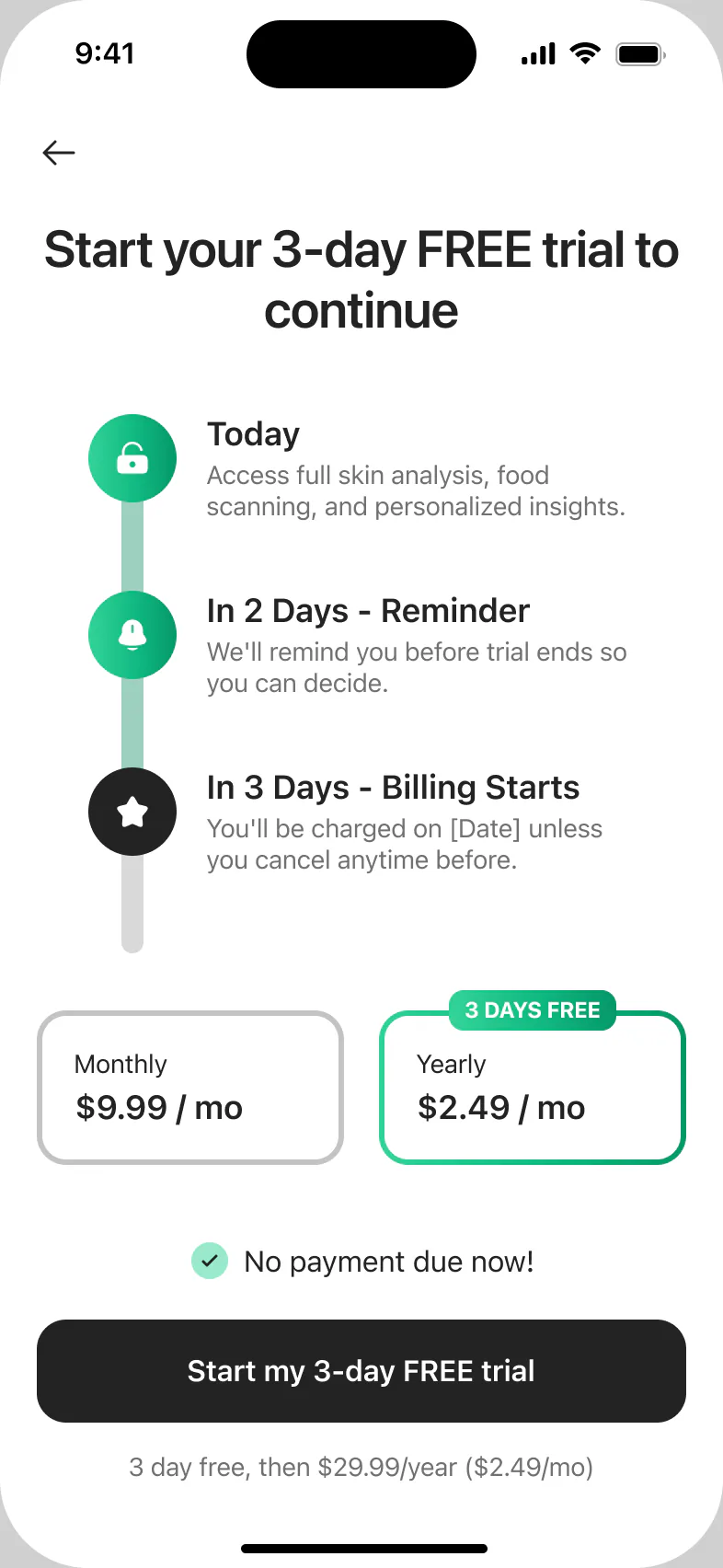
“No payment due now” above the button, a reminder before the trial ends, and a clear timeline: today, a reminder on day 2, billing on day 3. Monthly and yearly plans side by side.
What I’d test next
These are ideas for A/B tests, not measured results.